As part of our third-year submissions, I designed and published a portfolio which showcases my best project work and skills that I have acquired over the duration of my studies. Below is a digital version of the portfolio I have created which has interactive elements built into it. Most of the projects shown within this portfolio is work I have completed throughout year 2 and 3 but also a few projects from a Wickes Design Consultant job I was able to attain in year 3.
If you would like to download the standard version of the portfolio, click here and feel free to connect with me through my social profiles.
Be sure to click on the video embedded or even on the buttons within the projects below to open the full webpage which shows more detail on the processes and the final outcomes.
Since my experience with Adobe InDesign is very minimal, I needed to have a rough idea of what I intend my portfolio to look like? What will the theme be? Colour schemes? Which projects? Size and quantity of pages to aim for? And much more. To begin with, I researched various tutorials on InDesign since this was the application I wanted to use and upskill within and also looked into various printing companies and guidelines to ascertain what the bleed depth, margins and page setup needs to be to minimise any faults in printing.
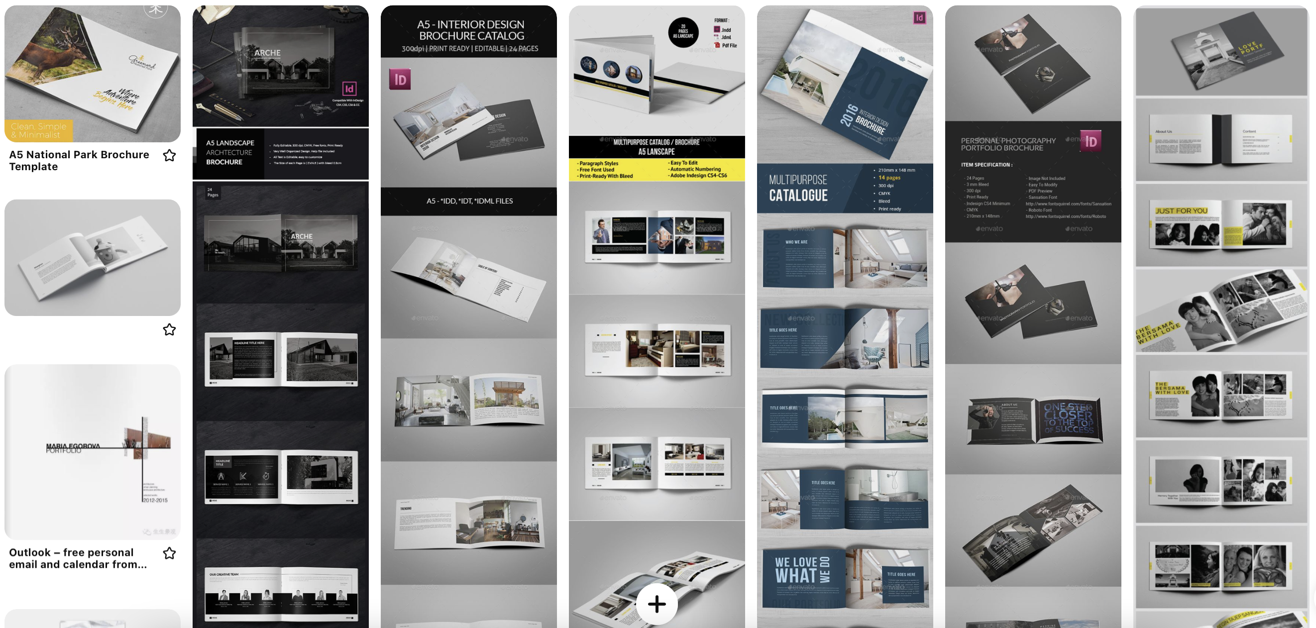
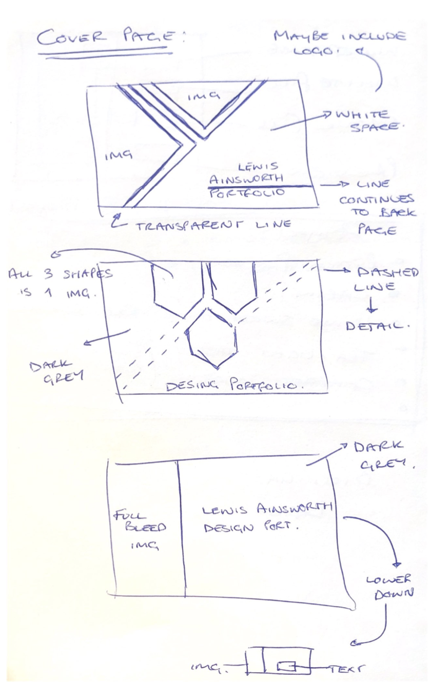
Once I had attained all the information I needed and learned the fundamentals of InDesign, I created a mood board on Pinterest and created a few sketches based on my mood board of what I would like my portfolio to look like or follow. This helped narrow down what I would be able to design with the limited skillset I have within InDesign whilst offering an aesthetically pleasing and modernistic finish for when a potential employer is viewing my portfolio. For this reason, I chose to go with the bottom sketch and add some geometric shapes which act as breaks within the image for extra design flair. This style was adopted throughout the portfolio and full bleed images offered the best experience for the type of renders I intended on showcasing. When creating the interactive version as seen above, I added numerous hyperlink buttons and embedded a video within the ‘Kia Ora’ project since potential employers may use these features and view the projects in detail or be more intrigued by my skillsets shown through the building animation video rather than still images.


Once the general portfolio was created, I sent the file of to two separate printing companies, “Printed” and “Youloveprint” since they offered the type of cover and style of portfolio I required for a competitive and fair price. The portfolio sent to “Youloveprint” was a saddle stitched, A5 landscape gloss landscape print with a soft touch laminate cover page. The portfolio sent to “Printed” was a perfect-bound, A5 landscape gloss print with 300gsm front cover and 170gsm pages for extra weight and better feel for the product in the hand. The two portfolios were delivered on time by the end of April ahead of the submission in the middle of May. For the purpose of submission, the saddle-stitched, soft cover version will be submitted since the overall feel and quality of the print was exceptional, although perfect-bound style of binding was preferred from the initial ideas.