Negotiated Design Placement: Design Consultant at Wickes Winchester


Introduction:

For the negotiated design placement module during semester 2, we are required to attain a second 6 week placement or complete a group/personal project. Since I previously trained as a design consultant in year 3, semester 1, I was able to keep this job role and pursue it on a part-time basis. As a Design Consultant (DC), I am responsible for conducting home visits, creating kitchen, bathroom or home office designs and selling the plans with or without an installation quotation to the customers assigned to myself. Although the Kitchen and Bathroom Advisors’ (KBA’s) are responsible for attaining the leads and manning the showroom at all times, we are a small team of 4 based in Wickes Winchester and I was often more than happy to help attain some leads which allowed me to learn the products and how to pitch certain ideas better.

As a DC I am only able to allocate approximately 6 hours per customer which calculates to 3-4 customers per week that I am available to design for. This calculates to 12-16 customers per month to which we are expected to convert 4 out of 10 customers and quote 80% of all designs with the installation service which can make it hard to spend a significant portion of our time on designs. However, since I am learning the products and design techniques on the move, I often spend 6-8 hours per customer and I am able to fit 9-10 customers per month on a part time basis with a conversion rate of 2 out of 10, or 20%. Upon monthly reviews with my manager, my KPI’s are increasing with each month and average order value is increasing. This shows that my selling and design ability within a showroom is improving exponentially although I am not meeting some targets surrounding conversion, my manager is extremely happy with my progress and has forwarded a few of my designs onto the Regional Manager and Head of K&B (Kitchen and Bathroom) who are both pleased with the progress and my ability since they were unsure if I was suitable for the role to begin with due to university commitments and inexperience within the industry. Since starting at Wickes, multiple students have also been employed within the Hedge End and Southampton branch due to my progress and I’m very proud to have contributed to this movement.

Due to the nature of the role, I am often unable to spend a significant amount of time per customer; however, I have provided 4 projects below which covers the three areas that Wickes offer: kitchen, bathroom and home office design and installation. Each project has required slightly more time to design due to the scale of the projects or additional knowledge on the products and installation service we can provide on the home office sector for instance. These four projects also display my development within Fusion FX 2020 compared to last semester since I have focused on improving the lighting, the quality of renders and the overall design of each room by introducing placeholders and graphics to create a more homely feel when presenting the designs to my clients.


Showroom Layout & Customer Journey:

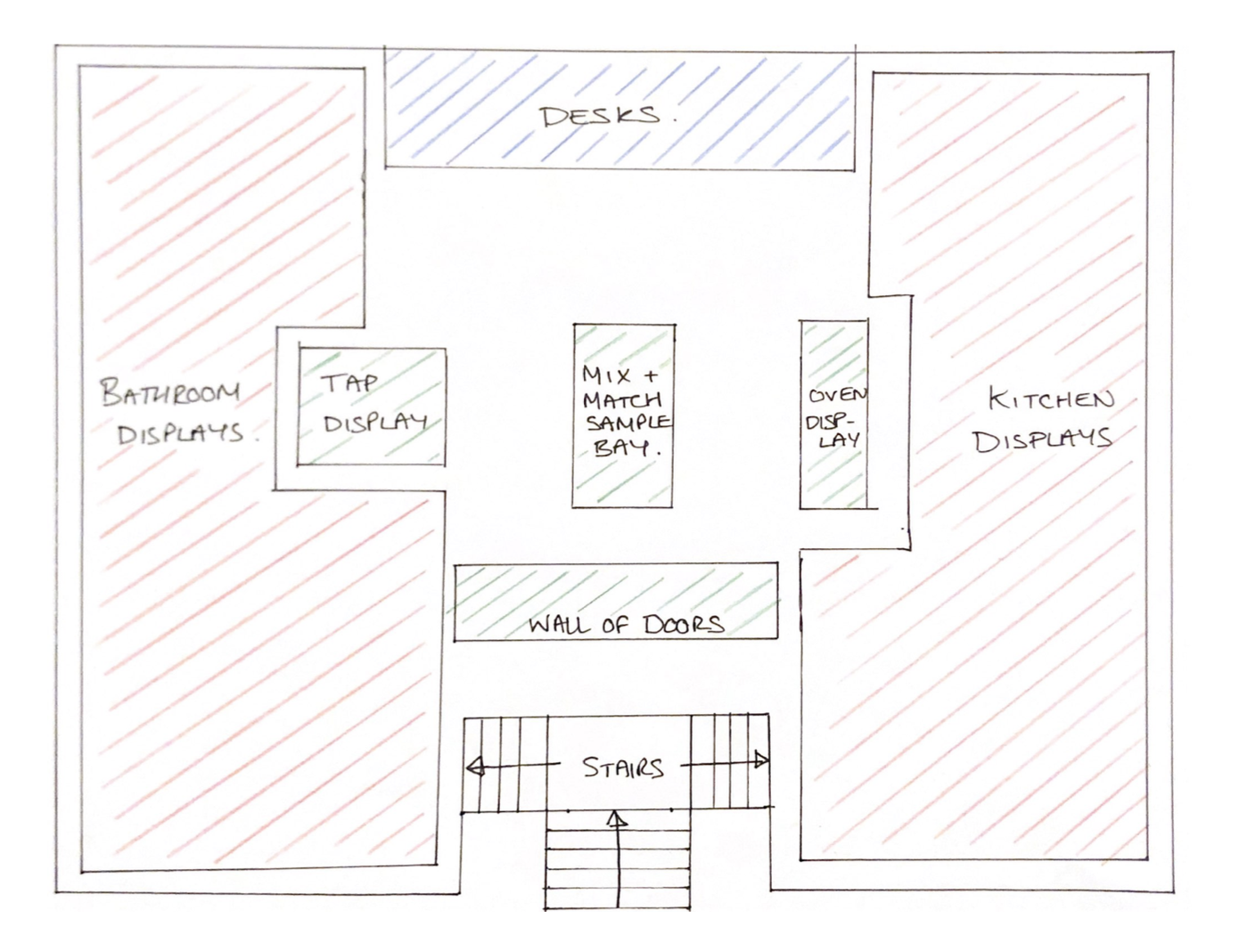
As per last semesters training, I was introduced to the importance of the showroom layout and making sure to utilise the displays wherever possible at both the lead-taking and reveal & close stage. Below is an sketch which shows the layout of the Wickes Winchester showroom which has been cleverly laid out to lead the customer’s straight to the displays which hopefully entices them into the middle after seeing several designs they like. In the sample builder stations, they are able to experiment with the ranges we have to offer and at this point, either the KBA’s or myself will walk up to the customer and talk to them about the products they are trying and the service we offer. In some instances, we often go back to the displays to show them some design features they may have missed and would really like to take forward. Although this stage seems ‘pushy’ it is incredibly important for us to briefly ask if the customer needs our help or would like more information about our products as it plays a vital role in creating an enjoyable customer journey. In several instances, I have been able to design for customers who have said from the start they are impressed with our friendliness and transparency from the start since a few customers have gone to other showrooms such as B&Q and Homebase and are not impressed with the team. Moreover, as a team we make sure to offer tea’s and coffee’s whenever possible to ease the customer and provide a more personal experience as mentioned in my monthly reviews.
The customer journey starts at the moment we talk with the customers. Below lists the steps we use to guide our customers through the process right up to when the installer manages the client:

Lead Taking
Pre-call 1
Home Visit
Designing
Pre-call 2
Reveal & Close Appointment


From this journey, DC’s are responsible for the processes between pre-call 1 and the reveal & close appointment but in some instances I like to get involved at the lead-taking stages when I am quiet and help improve my social and customer service skills. Recently, Wickes has demerged from Travis Perkins and has invested a significant amount in a new online, customer logging system known as Zendesk. With my experience I was able to pick up the tools and techniques to log customers on this new system which massively helps visualising each client’s journey and the stage at which they are at. Also, the new system is available as an app which I use on the home visits to take photos and keep under the customer’s profile. I believe this new system has also allowed me to manage my time more effectively and has supported my ability to sell designs with customers since instead of flicking through numerous photos or notes to find the customers profile, there is one place that allows me to see any notes I have created, all the photos I have added but also the customer installation journey and issues that have been raised.
Design Introduction:

Below are four projects that I have worked on, two of which have sold and two are due to be closed next week. I believe each project shows of my ability to create a practical and suitable space for my clients and have also been able to build a friendship with each client that hopefully brings them back in-store for a future project.

As per the customer journey, I begin with a home visit where I collect information on the project and take measurement of the space. In two of these projects I was provided with architectural plans since the extension and newly built home was not yet plastered at the home visit stage. To overcome this, I create the plans based on the drawings and attain all the information required at the pre-call stage. Once the design has sold, I arrange to visit the property 3 weeks before their chosen delivery date and confirms all measurements are correct on the plans. If for any reasons the measurements are wrong, I am able to exchange the units for different sizes and have this delivered instead. However, when we have conducted a home visit, the journey remains very much the same and I am able to design everything needed for the project based on this home visit pad.

I begin with creating the walls and setting the ceiling height of each room. I then add doors, windows or any other false walls and boxes which run alongside the main walls. Once these graphics are added, I begin to set the default styles for each room based on the customers preferred range choices. This allows the catalogue on the left of the screen to display the products available in this range and if there are any out of stock issues. Once the default style has been set, I begin planning the room based on the pre-call information or home visit pad that I have completed. After this stage is complete and the general layout of the room is constructed, I begin to add flooring and wall graphics such as tiles which brings the design together. Last semester I did not focus on placing graphics or placeholders since I was predominately focusing on the design and tools within the program. However, I experimented with the catalogue and was able to find and note down my favoured graphics that helps to create a better design. Some of the placeholders are outdated or have poor texturing hence I often use the same or similar set of graphics in each design and manually override the graphics when possible. After this step, I calculate the flooring or tiling coverage whilst creating renders ready for the reveal and close appointment. After I have noted all the installation activities required for each project, I leave the program and use the system which calculates and builds an installation quotation for the customer if they have chosen our Wickes service. Previously, I would miss some minor activities whereby the installer dropped an email and I was able to amend the order and cover the cost through the store but I am currently quoting each installation 96% successfully and the installers often drop an email back to confirm their satisfaction with my work and are happy to go ahead with the project as per the quote I have made. The reason it is 96% is because I purposefully missed some electrical work since the customer required the fuse box to be replaced and significant amount of electrical work to be done through our service and both the team and manager were unsure of the activities needed so we spoke to the installer who was aware of the work and happy to quote for this privately but was extremely happy with the rest I quoted therefore only dropping 4% since the start of this year. Once the reveal and close appointment is completed, I either take payment of the order or provide all the quotes and images and remain in touch with the customer to arrange a second appointment if they are keen to go ahead.

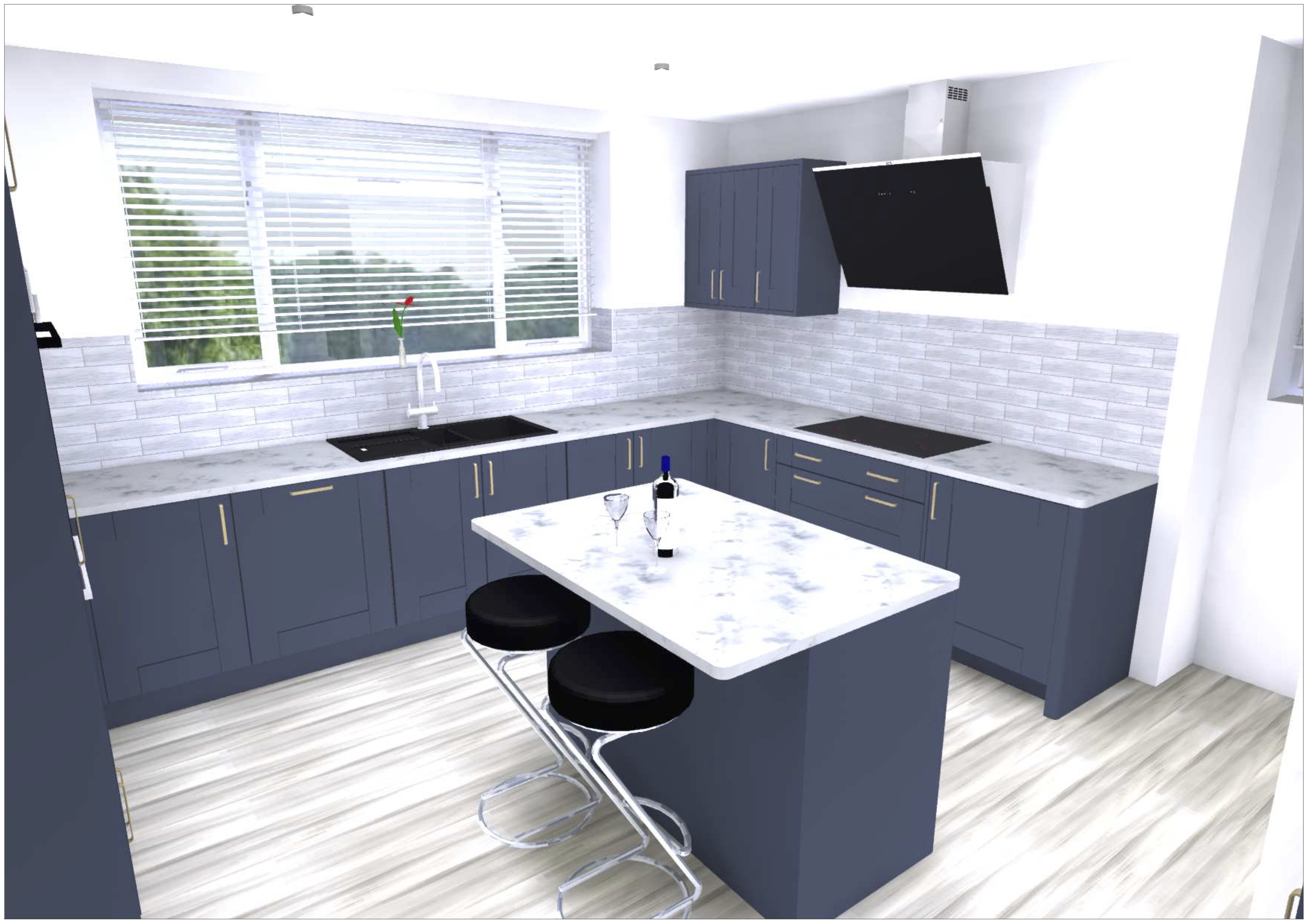
Kitchen 1: Milton Midnight with Slabtech Worktops

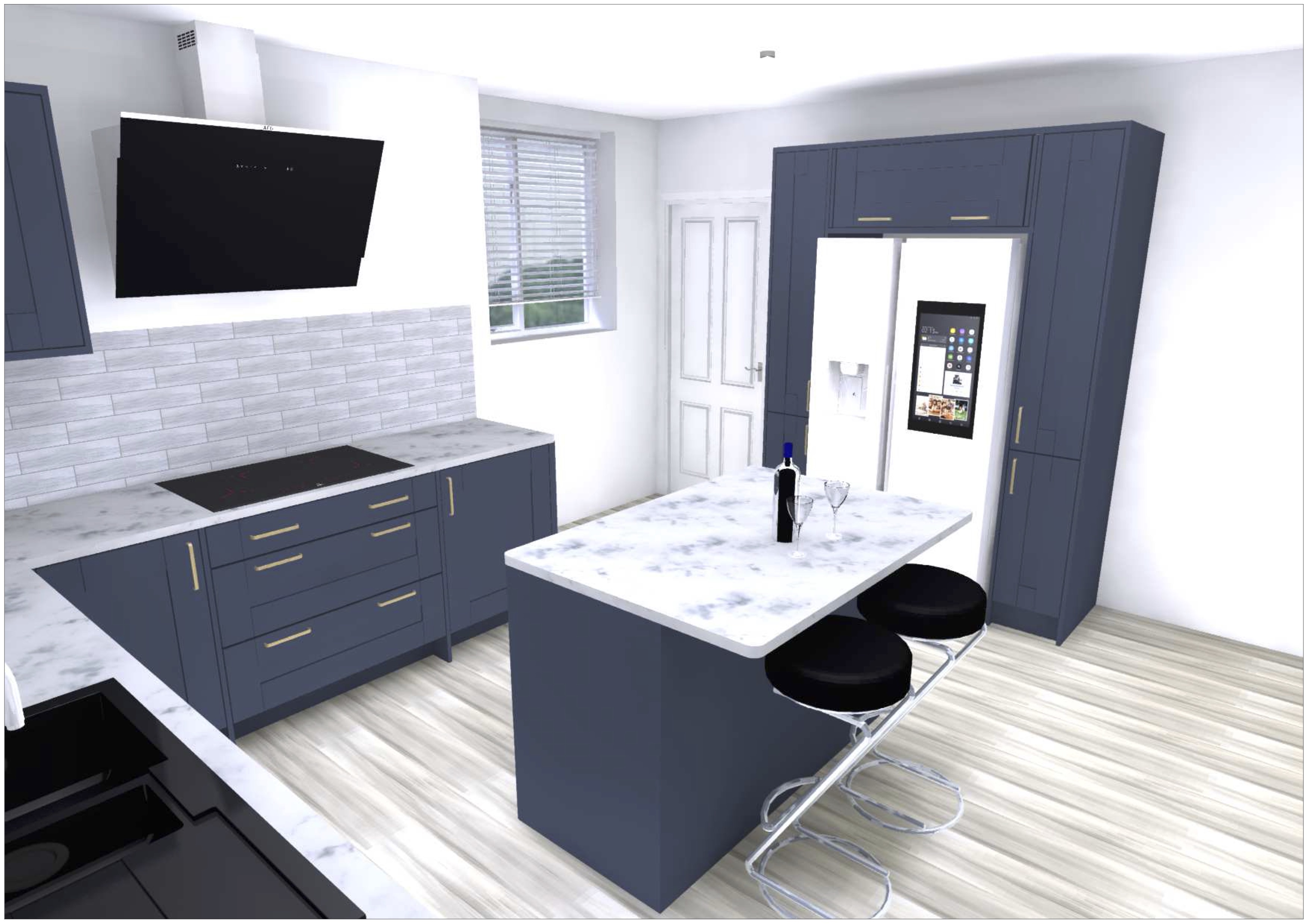
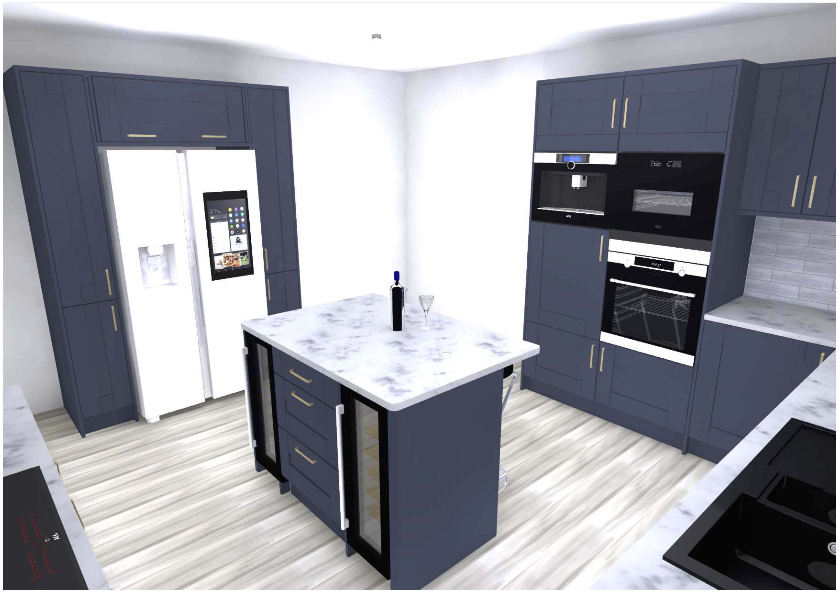
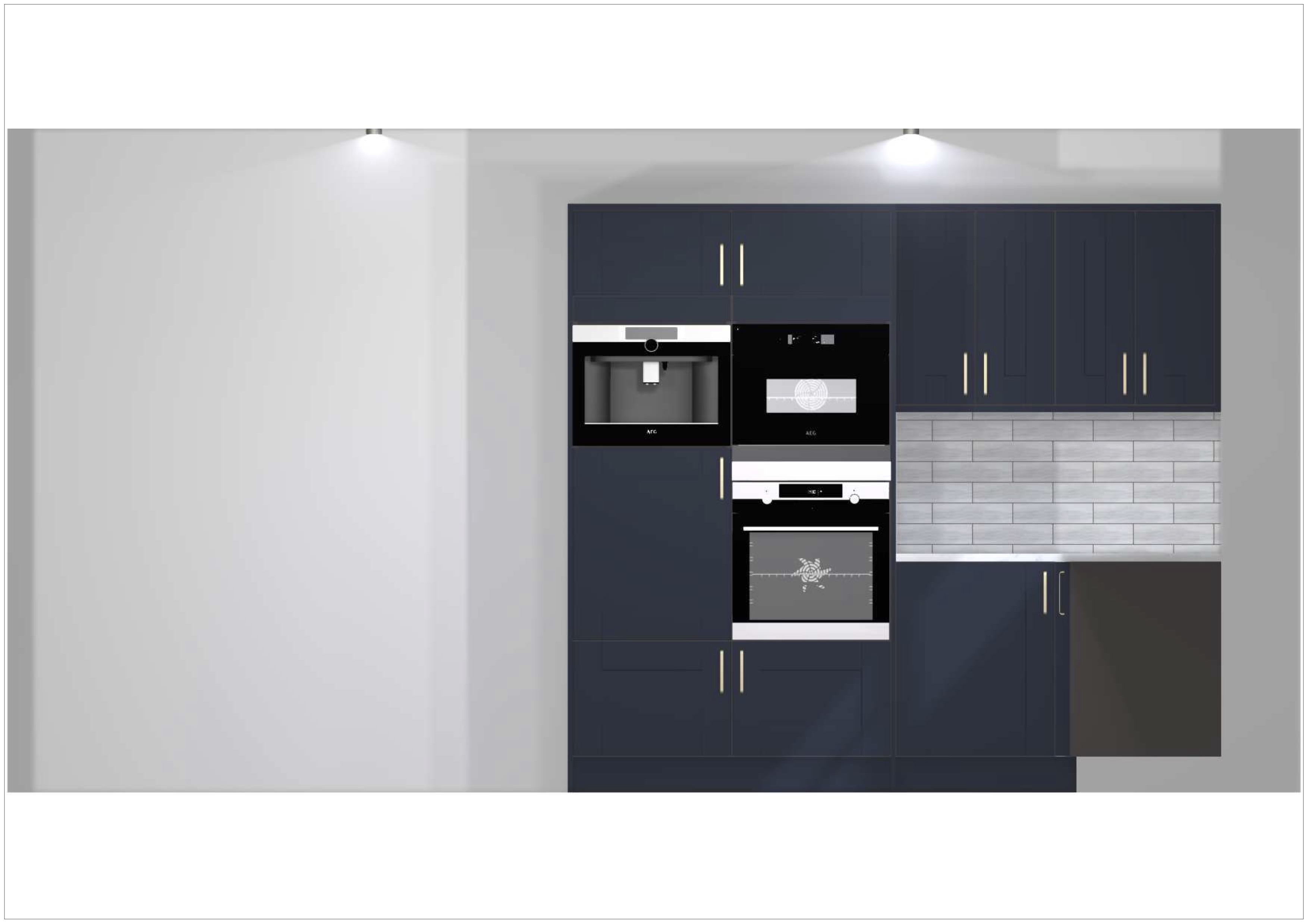
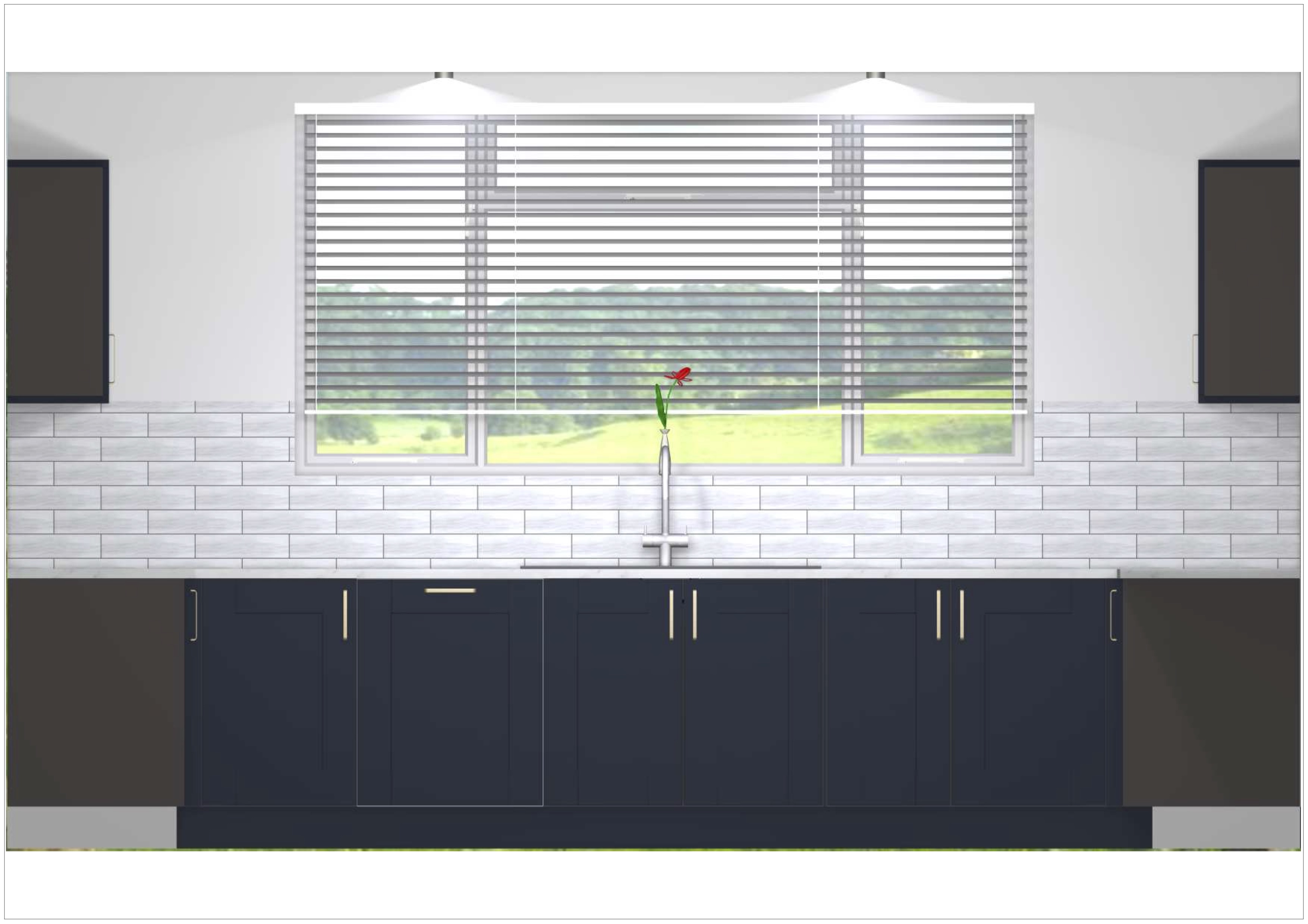
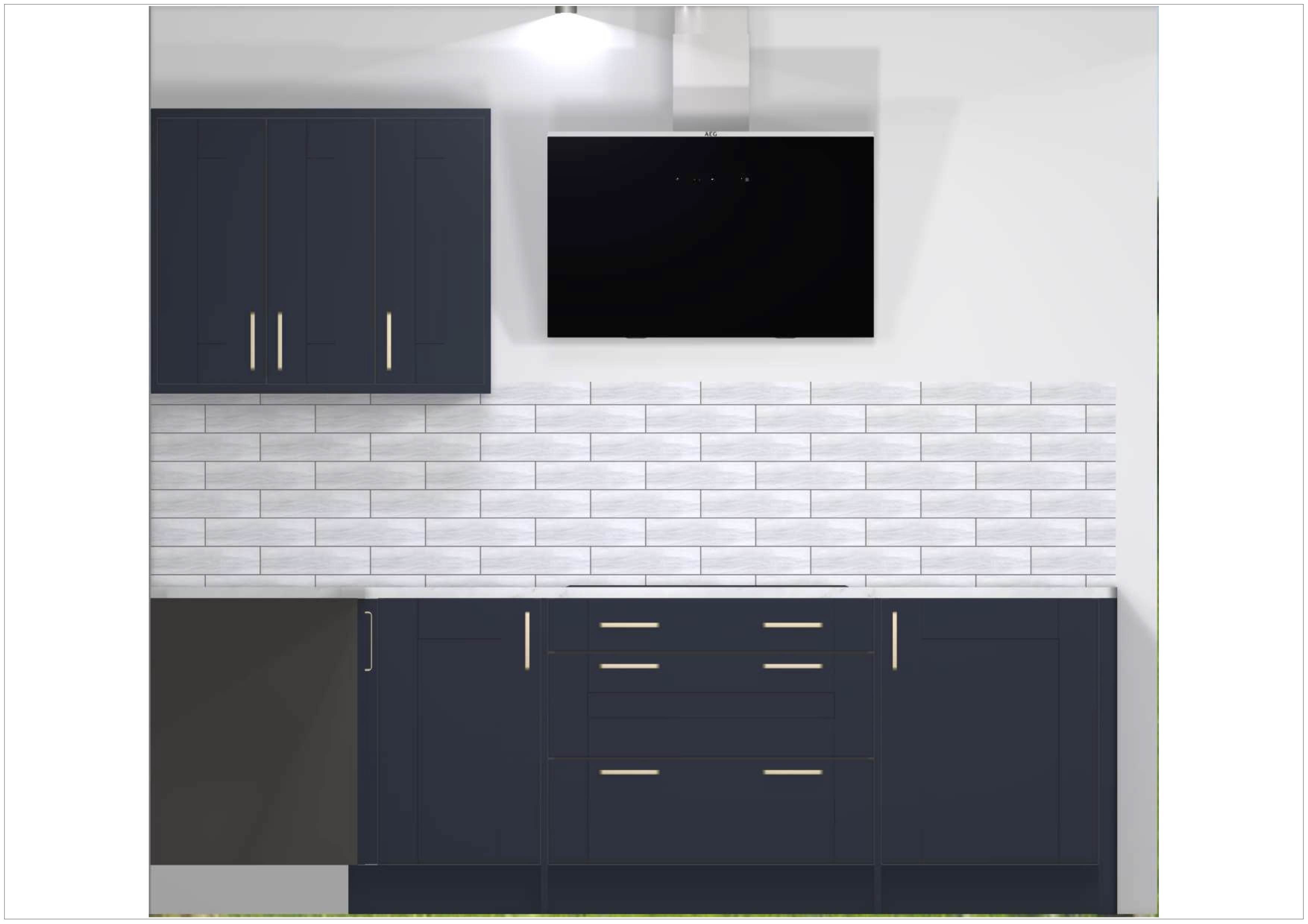
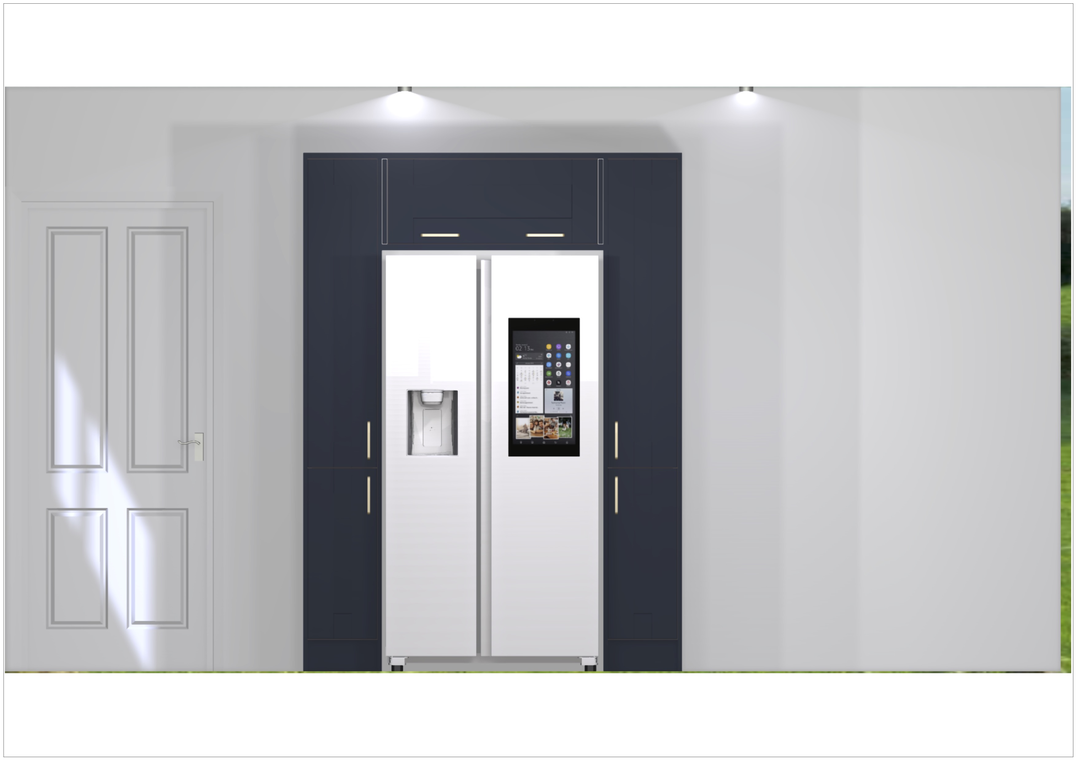
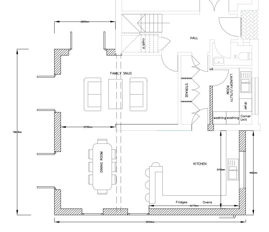
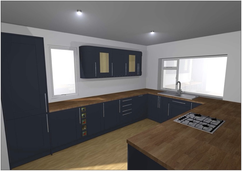
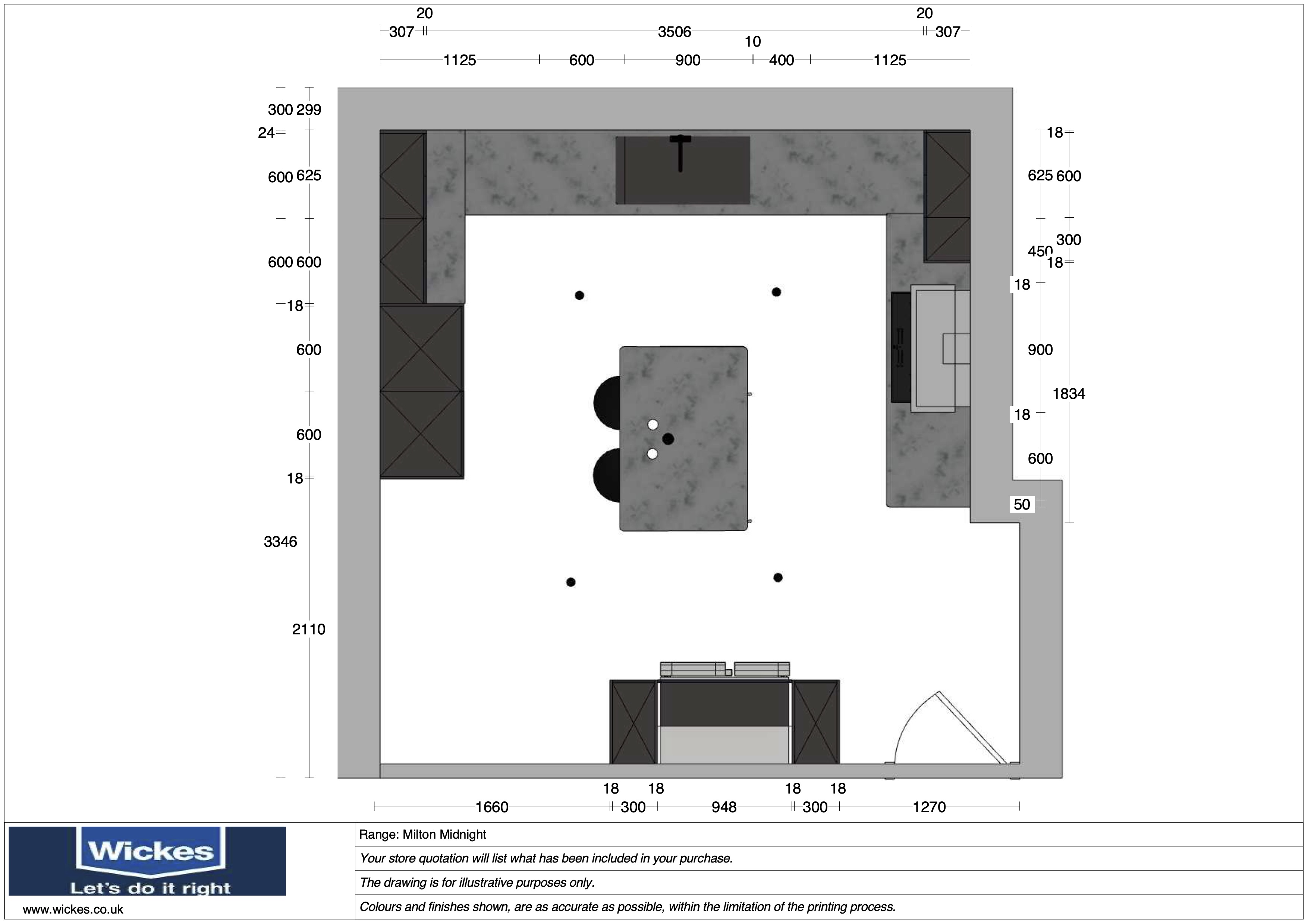
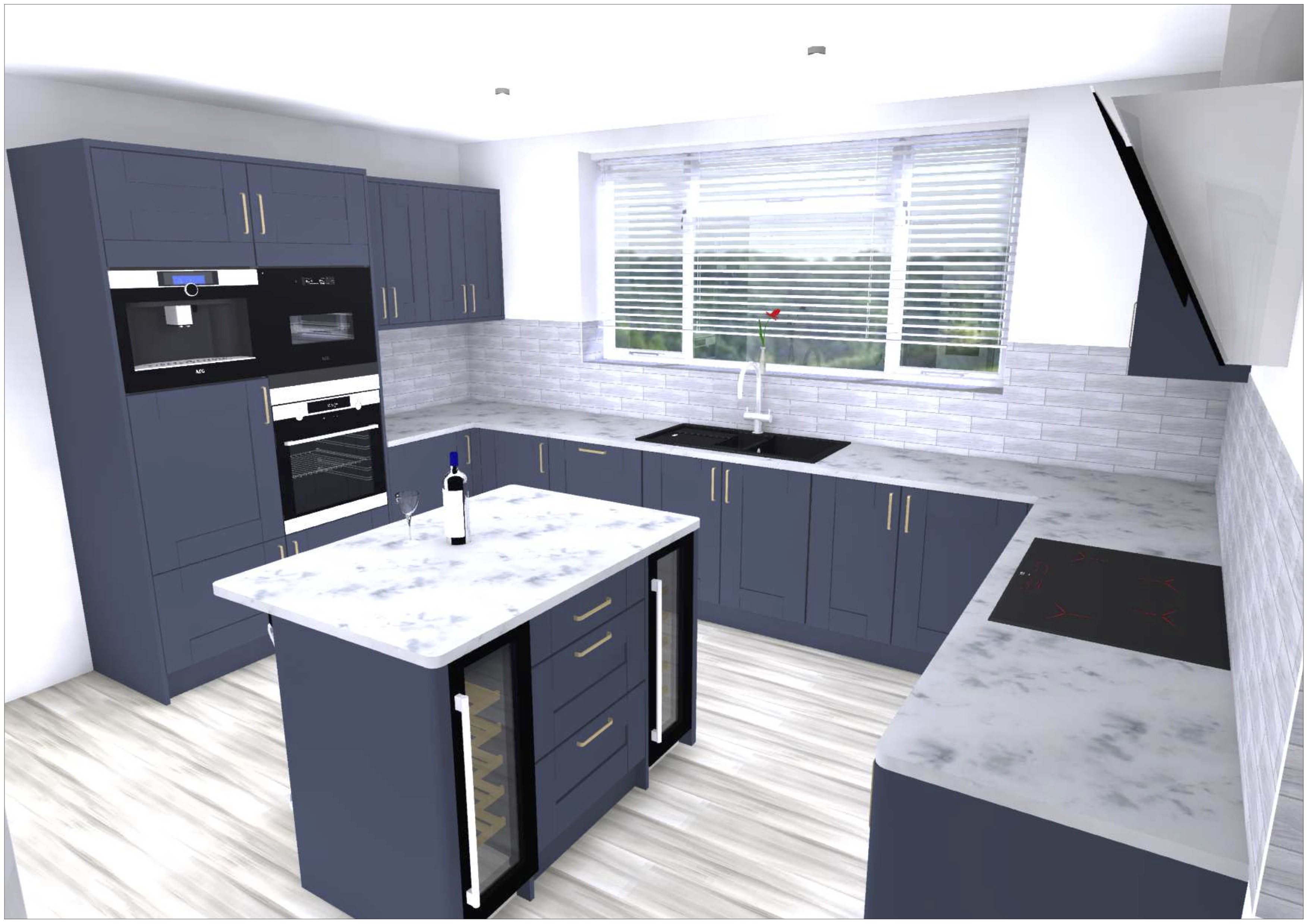
My customers for this project walked around the showroom for a short time over the course of a few days. Each day they popped in I was able to ask if they needed any help and each time they were more interested in our products and service. Once they were ready to go ahead with the Wickes design service, they asked to have me design their space since they were happy with my knowledge and friendliness each time, they popped in. Their house was still under construction and therefore provided me with some measurements and since I was able to talk to them on numerous occasions prior to the design stage, I had a good idea of their wants and needs within their kitchen. I began designing the space in front of them to get a general idea of their preferred layout and place a bulk of the units down. However, since the project was one of the largest I worked on, I continued working on the designs after our appointment and booked them back in for the following week to review the designs. Since my clients wanted to put a large budget towards their kitchen, I researched some of the products we have and spoke to Gower, our kitchen supplier regarding any additional features that they can add to some of the units. I was able to design he units with a navy front and one of our engineered (solid) slab-tech worktops and request that the inside of the units and any additional fixings to be manufactured in an anthracite colour to keep in theme with the pure black appliances that they have selected. Upon our second appointment, they were extremely pleased with the plans and requested the insides to be black if possible which I had already done and therefore helped to show the customers my commitment to their project and making sure they get what they want out of their space. Almost 1/3 of their budget was spent on the appliances which required additional research prior to our final appointment to understand all the features of each appliance which essentially ‘makes the space’. These include:
AEG pyrolytic oven - burns grease to 500C ready to brush out
AEG warming drawer – keeps plates and bowls warm
AEG built-in microwave – acts as both a microwave and second oven if needed
AEG built-in coffee machine – saves space on the work surfaces and can make any form of coffee from fresh beans instead of capsules or pods.
AEG dishwasher – supplied with ‘easi-lift’ bottom shelf which lifts up to a more comfortable height for better ergonomics
AEG 80cm ‘Pure’ induction hob – provides 5 induction rings that does not display anything until touched to activate
AEG slanted extractor – also has a black finish and extracts at a low noise level and has ‘hob2hood’ technology which activates when the hob is on
Samsung Family Hub American fridge freezer – smart fridge which allows the client to use as a fridge or fridge freezer as well as all the Bluetooth and smart features built into the display
CDA 30cm wine coolers – stores 20 bottles of wine each and is available in a pure black model which has been provided in my designs

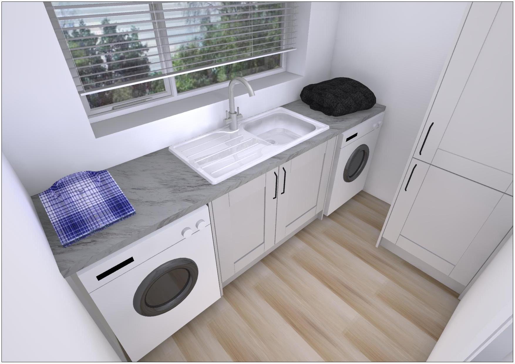
Once the appliances and designs were all confirmed, I finished of the designs with a few graphics and rendered the images ready to export and send to their builders which they used to plan electrical and plumbing works. Overall the clients are very pleased with the designs and have recently built the units and are awaiting the worktops to be fitted by our solid surface worktop supplier, Sheridans. They have come back over the course of the year to start looking at their utility, bathroom and home office designs which further reinforces how important it is to build a friendly relationship with our clients and provide our best service possible as it often leads to more opportunities.

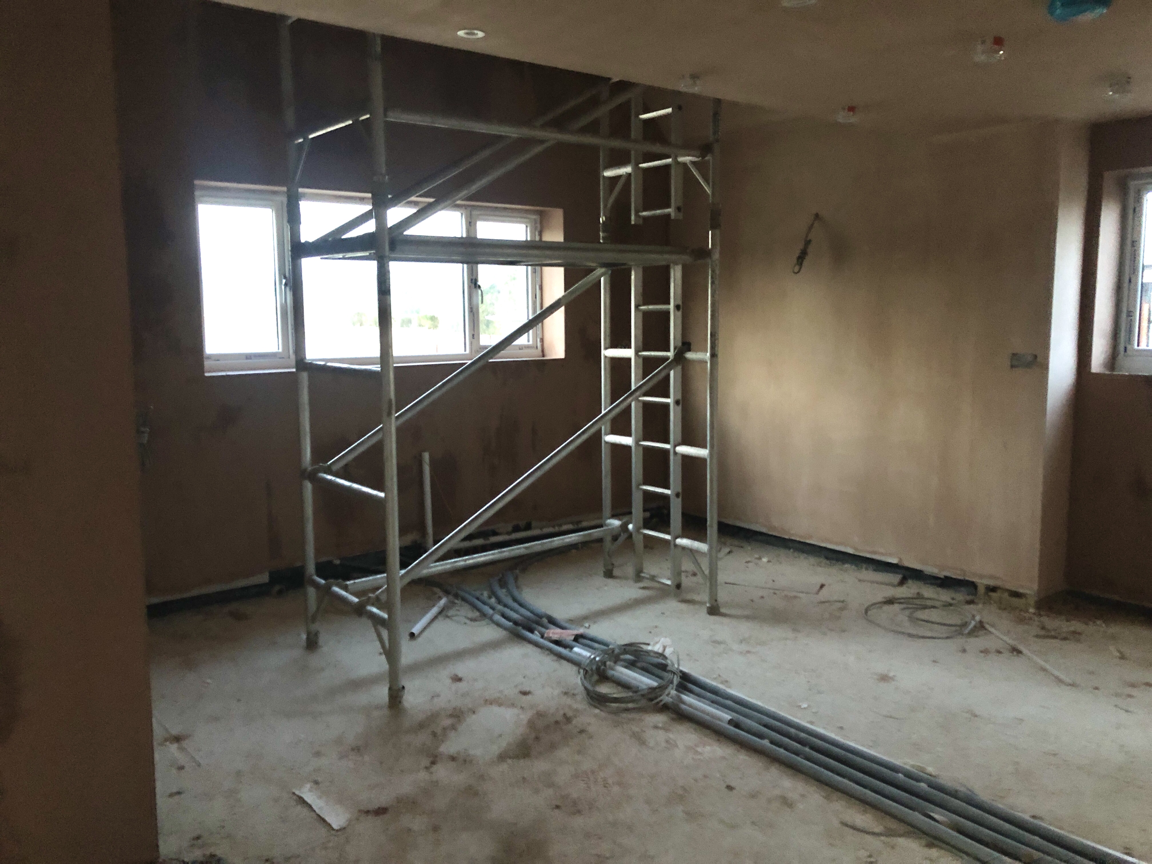
Although their project is not yet complete, I was able to attend the property to confirm the measurement which were slightly out by 20mm and a couple filler panels were removed that I had placed either side of the sink. Below shows the image of the kitchen space right after plastering which I hope to take the same picture in a few months of the finished space ready to add the before and after photos to my kitchen portfolio.


Kitchen 2: Milton Grey with Lyskam White Quartz Worktop

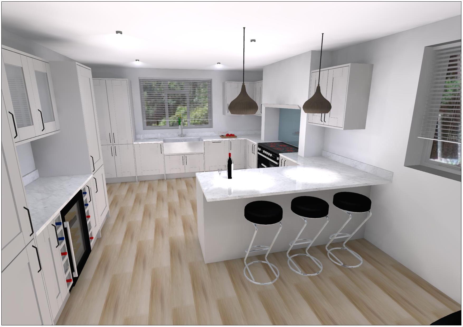
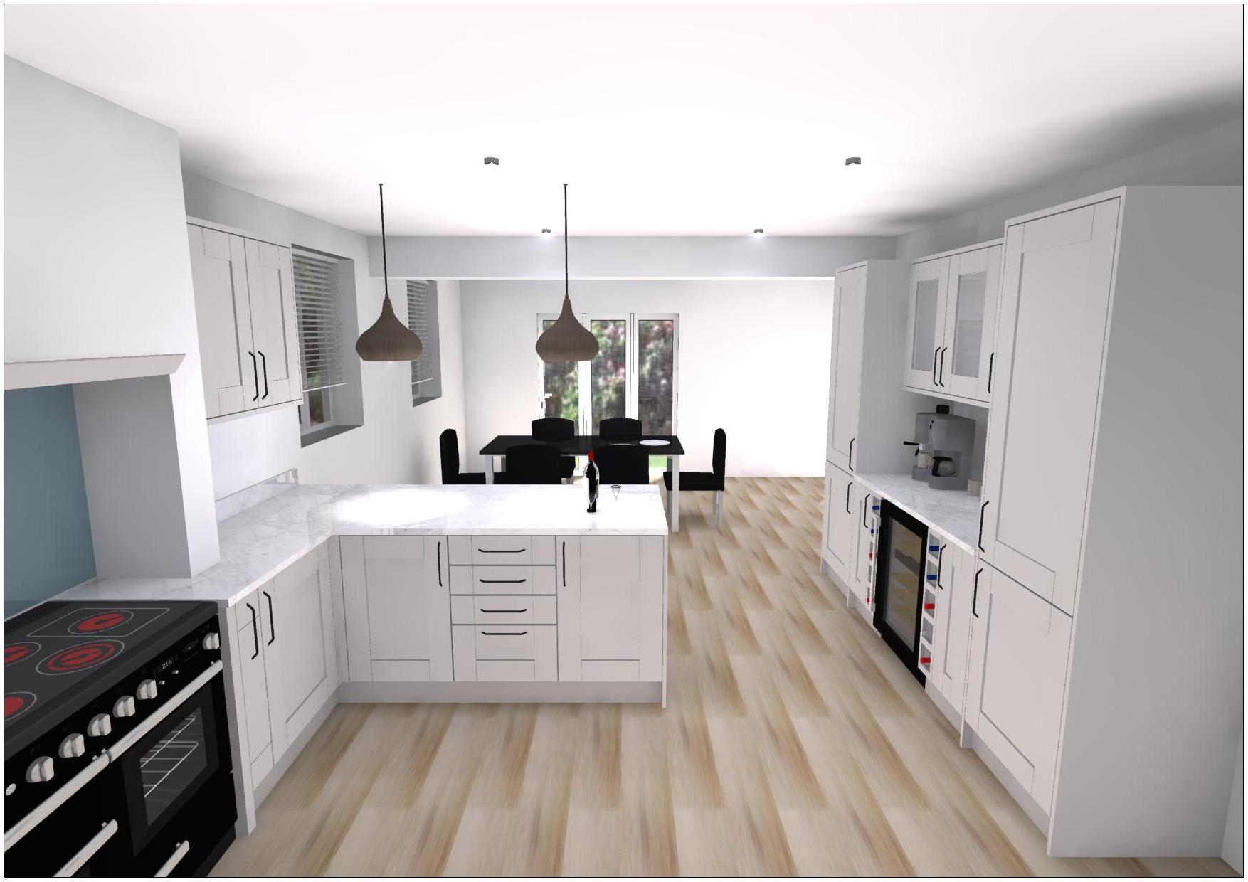
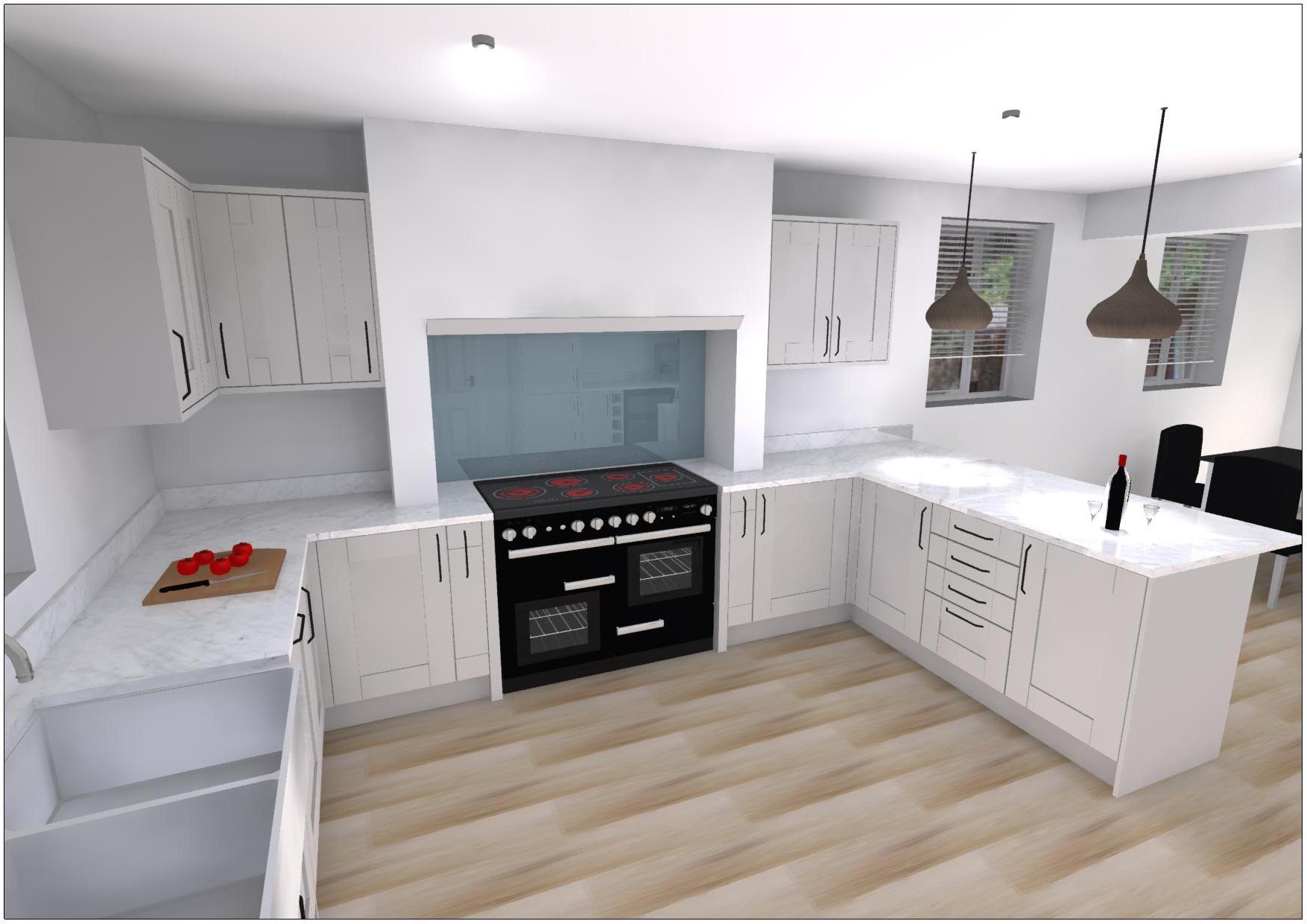
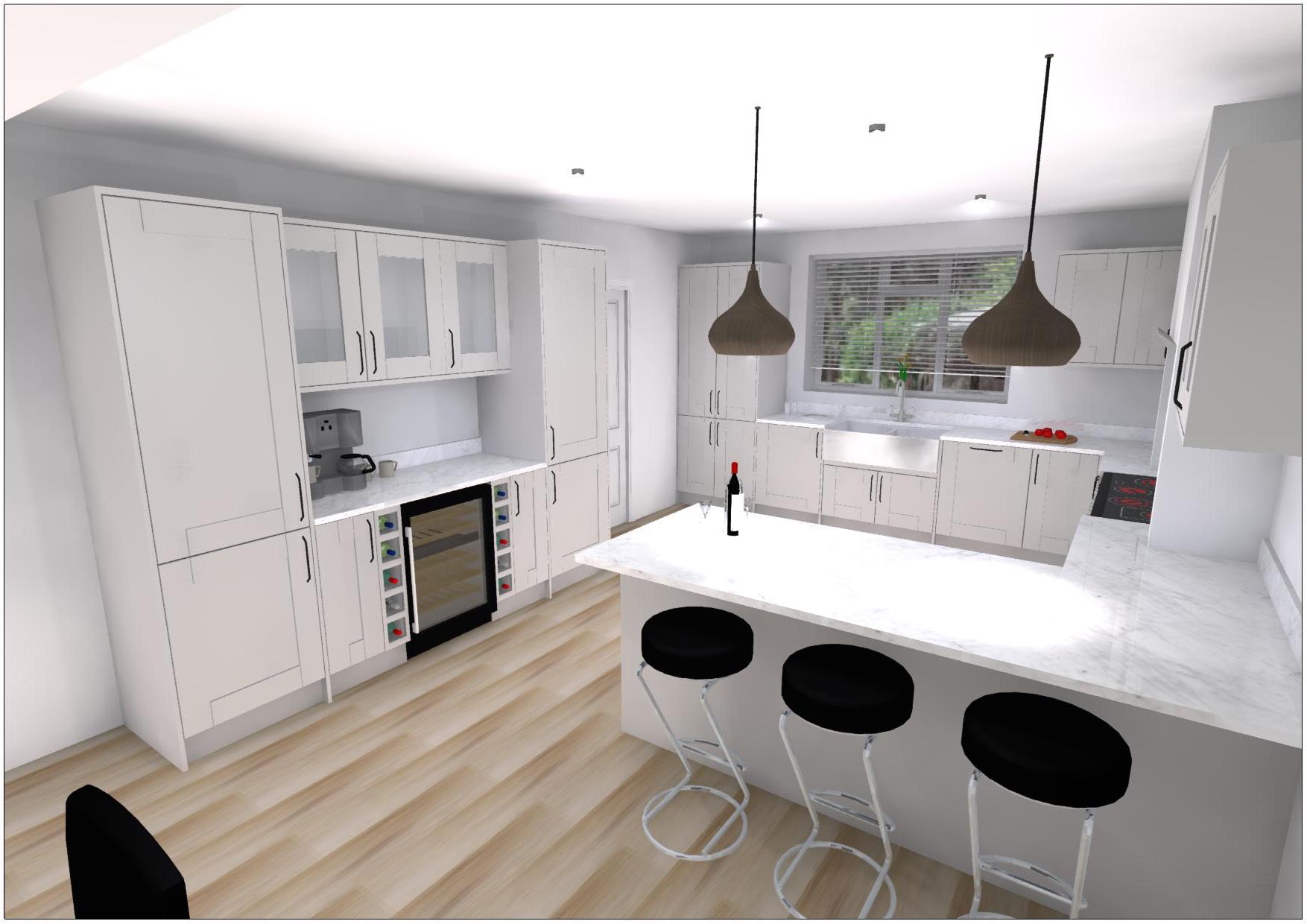
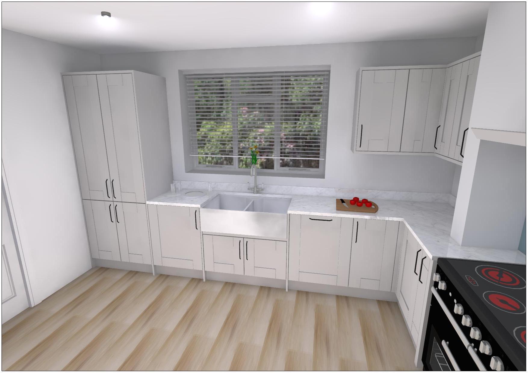
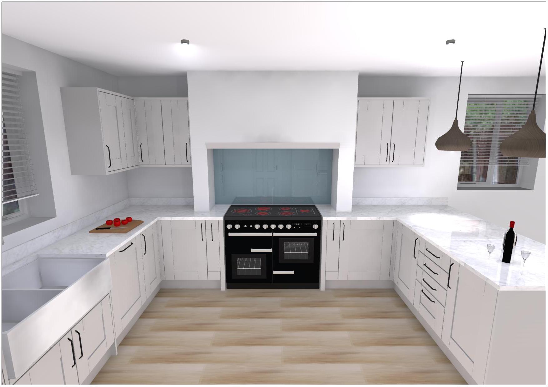
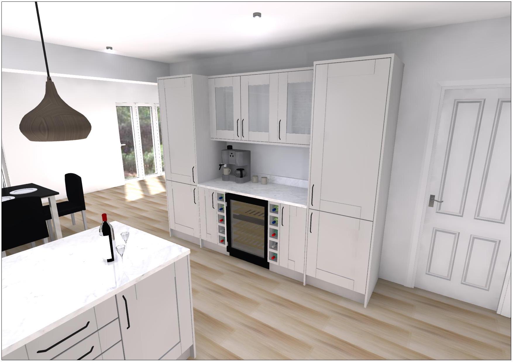
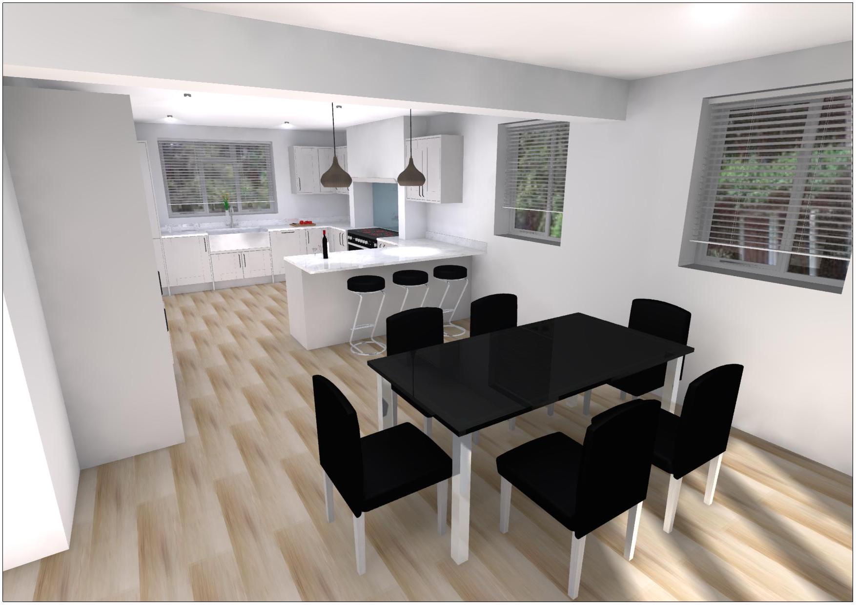
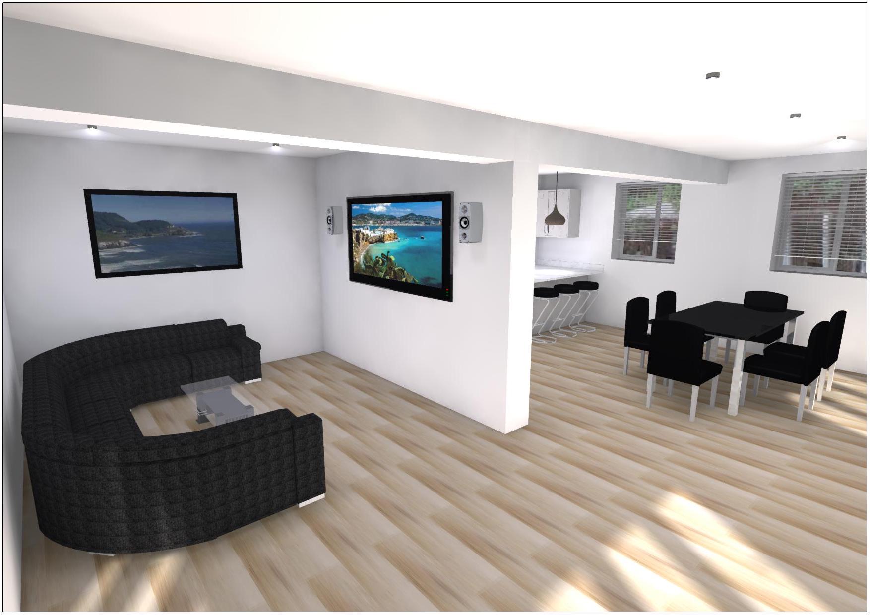
One of my biggest kitchen projects to date, is this design I completed several weeks ago. Similar to the first kitchen, the property was undergoing an extension and the actual kitchen space has not yet been built. However, architectural plans were provided and using the scale provided, I was able to design the bottom floor with no issues. Furthermore, since these customers were assigned to me through our online team, I completed a strong pre-call a week before their appointment with myself to attain all the information about their space and what they are looking for. Luckily, they are aware of the ranges we sell and had a strong idea of what they wanted. I designed this space which includes all their wants and needs such as a rangemaster oven and separate fridge freezer which where two difficult areas for me within this plan. This is also the first plan where I have been asked to design a mantel area around a rangemaster oven and therefore I browsed Pinterest and images online to get an idea of what an enclosed area looks like around these types of ovens. Their general focus was creating a space for their rangemaster with a mantel overhead, but they also wanted a space to act as a drinks bay or station. As you can see from the images, after several tweaks, we built the drinks area with the fridge and freezer either side and glass wall units and wide base units bridging between the two. The customers were pleased with this design and believes it works very well with how they use the spaces as they often like to use the breakfast bar to chop and makes sense for the fridge and freezer to be located on this wall right next to the breakfast bar than by the sink on the other side of the room. Once I had created the general look of the kitchen, we explored the displays in store to get an idea of the worktops they wanted but also the splashback for the rangemaster. We agreed that our ‘Lyskam White’ Quartz worktop and ‘bluebird’ alusplash back board added a modern yet colourful appeal to the design and bring the whole design together. Since the customers have a building firm working on their extension, no installation quotation was needed. To finish off the designs, I added some placeholders and also experimented with some of the graphics built-into the program to create their dining and living room area. The customers are thoroughly happy with this touch as they have already chosen black furniture the previous day by chance and believe that their new kitchen and utility design fits extremely well within the space. Since this was the biggest project,I have quoted to date, I learned how to use the virtual 360 software built-into the program and emailed this design over to them. Please feel free to click here to view the virtual room.


Ensuite Bathroom: Vienna White Furniture with Recessed Shower Enclosure

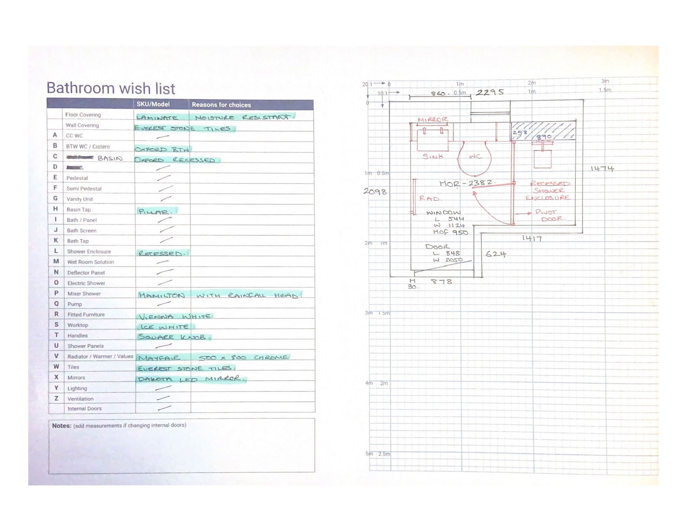
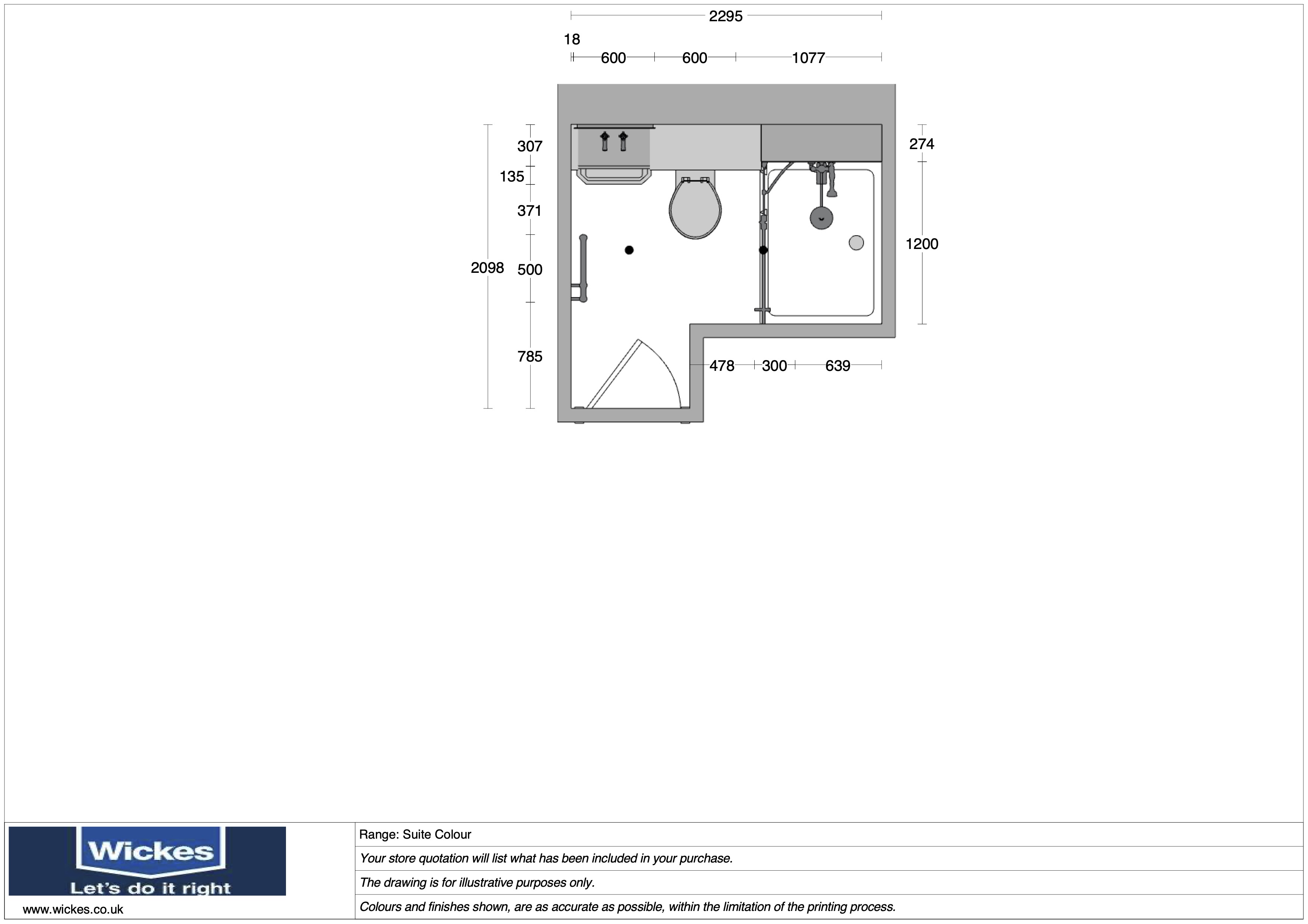
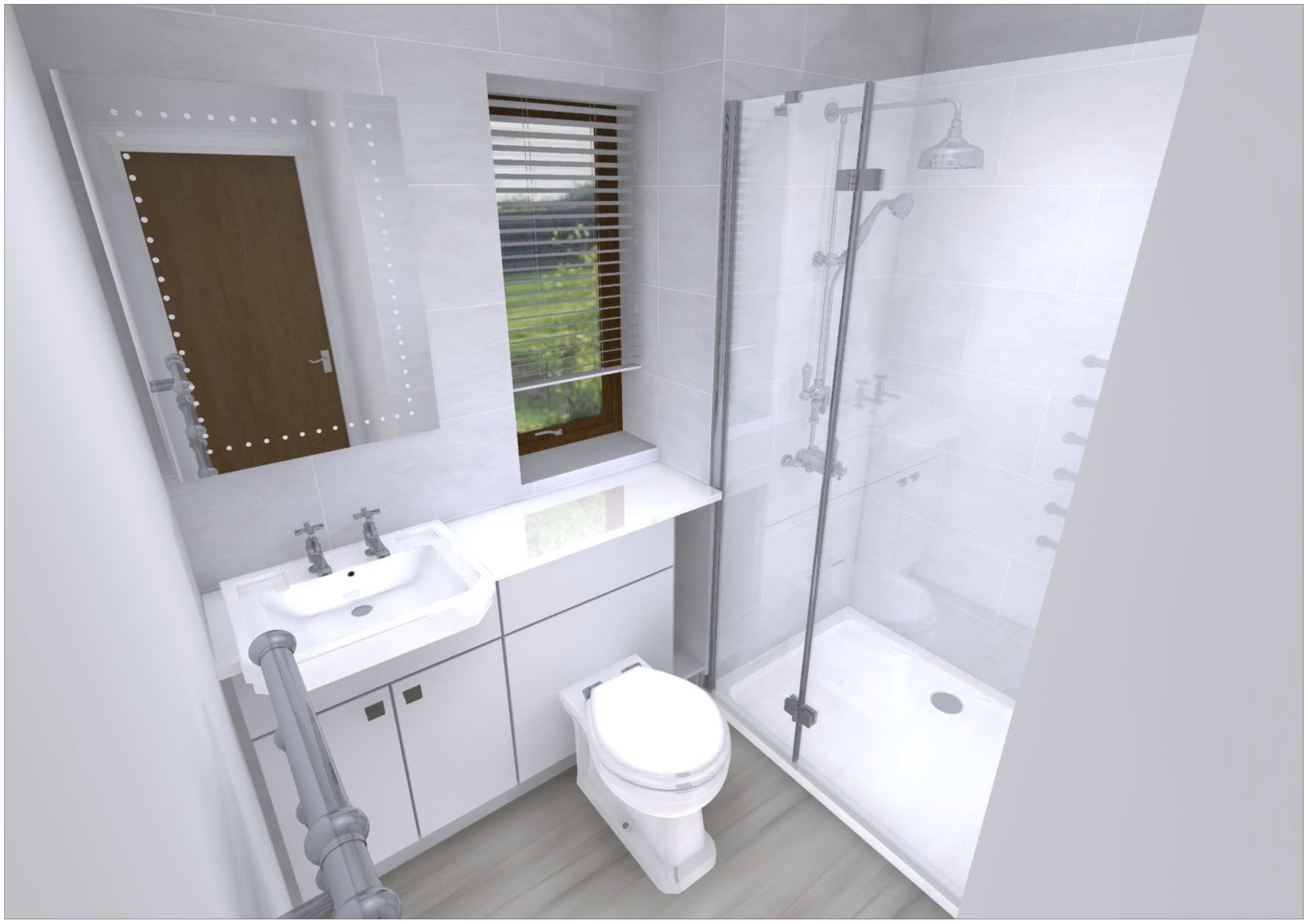
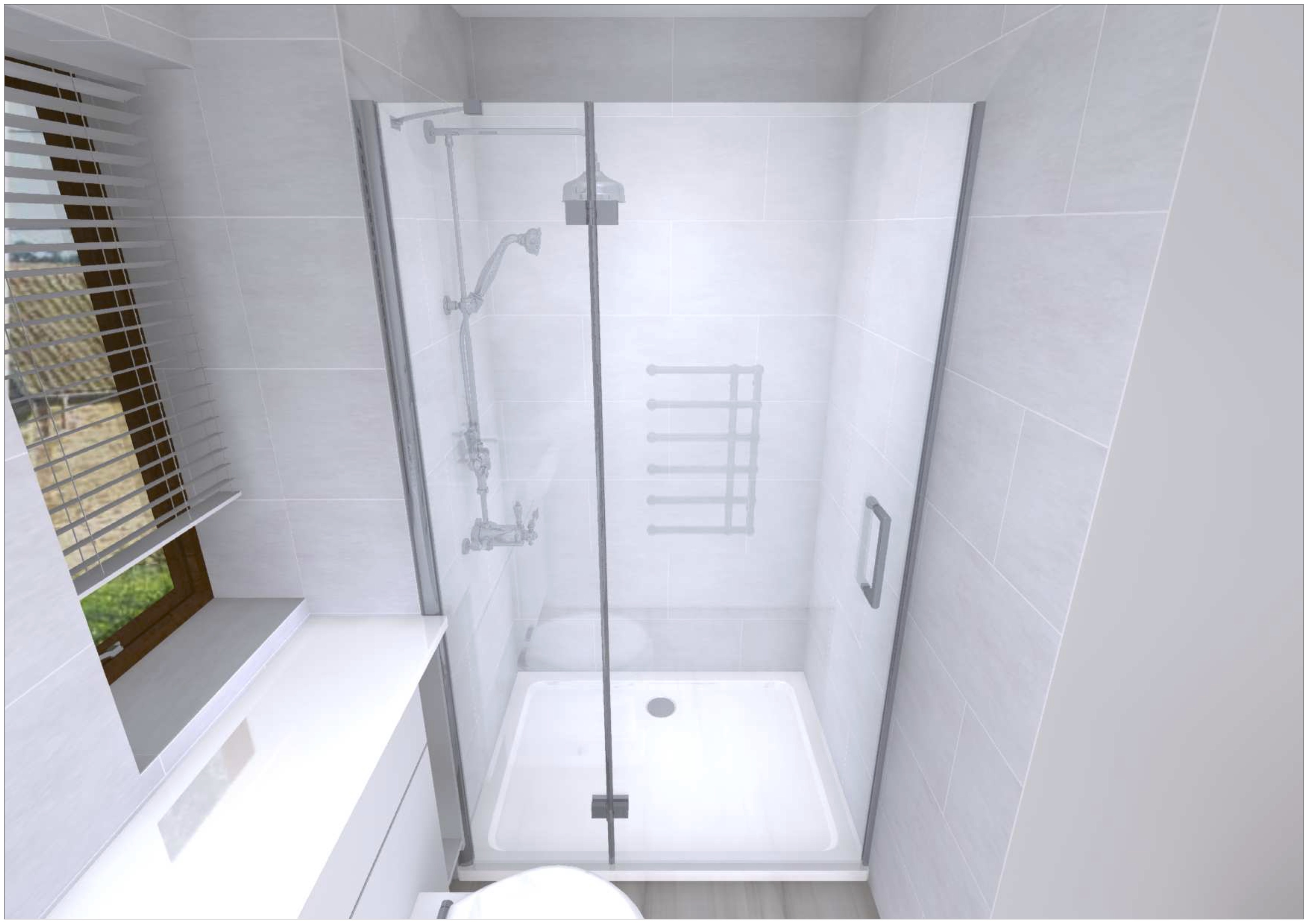
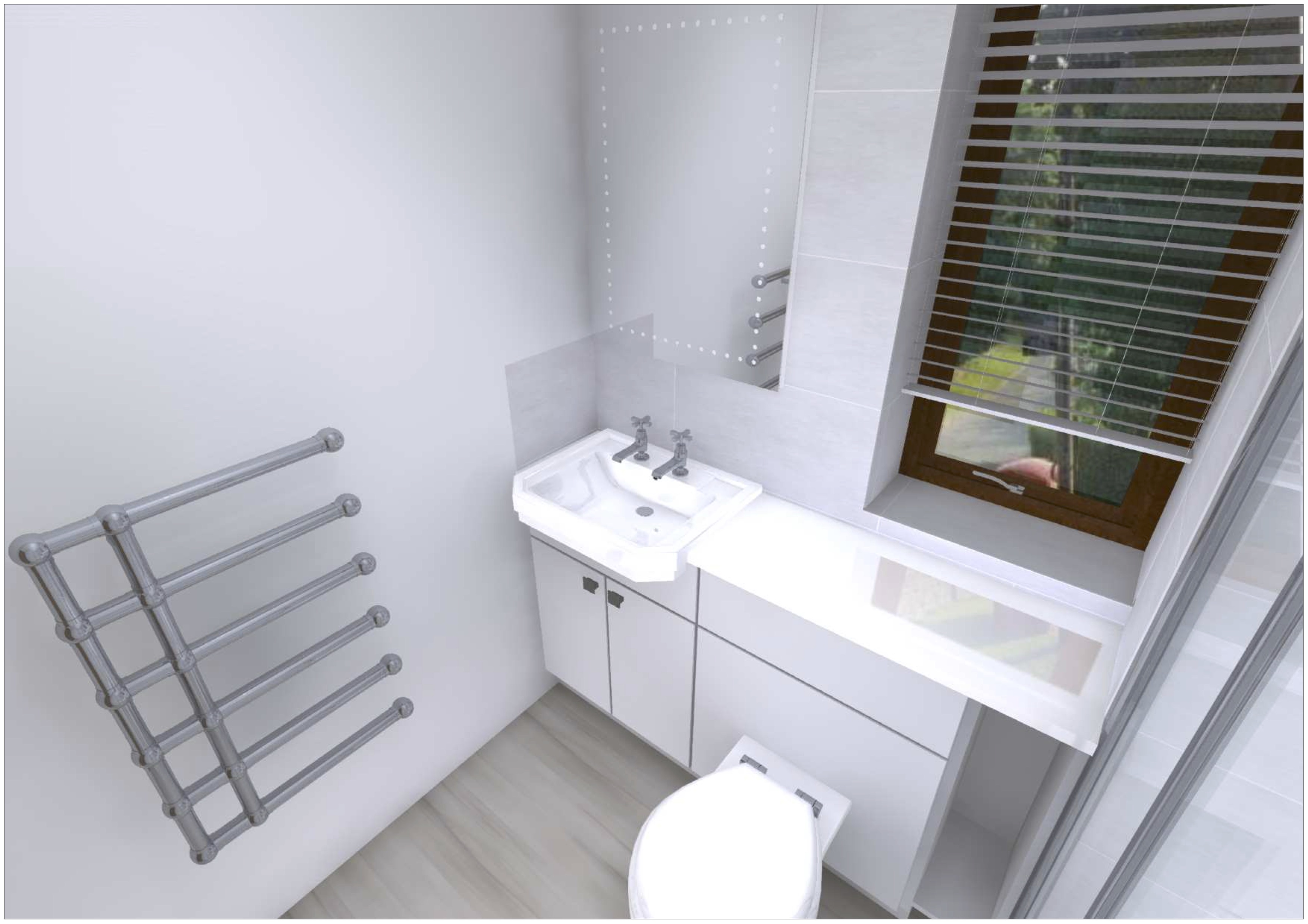
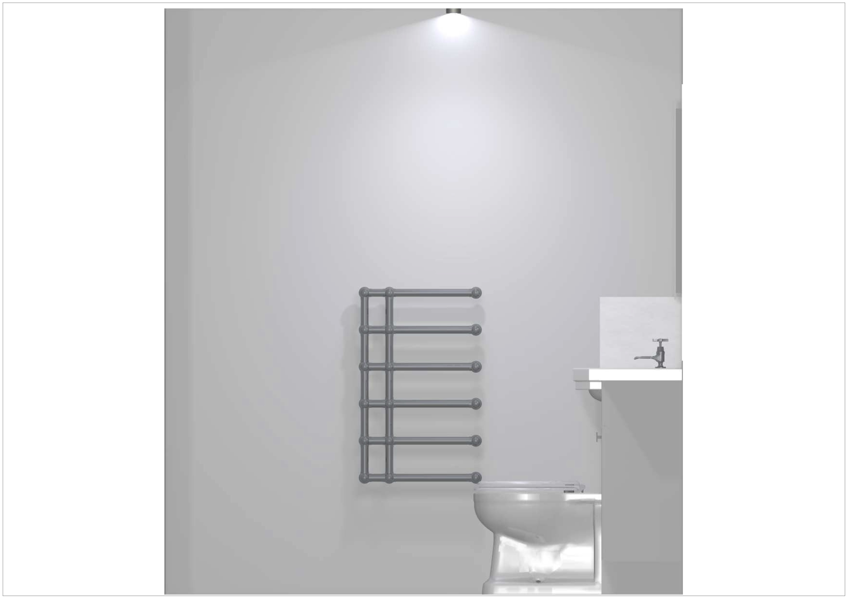
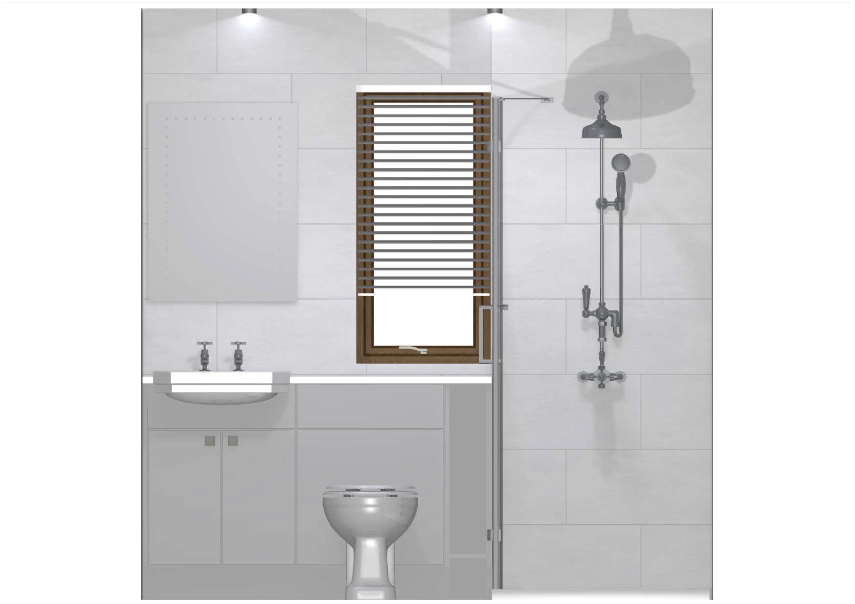
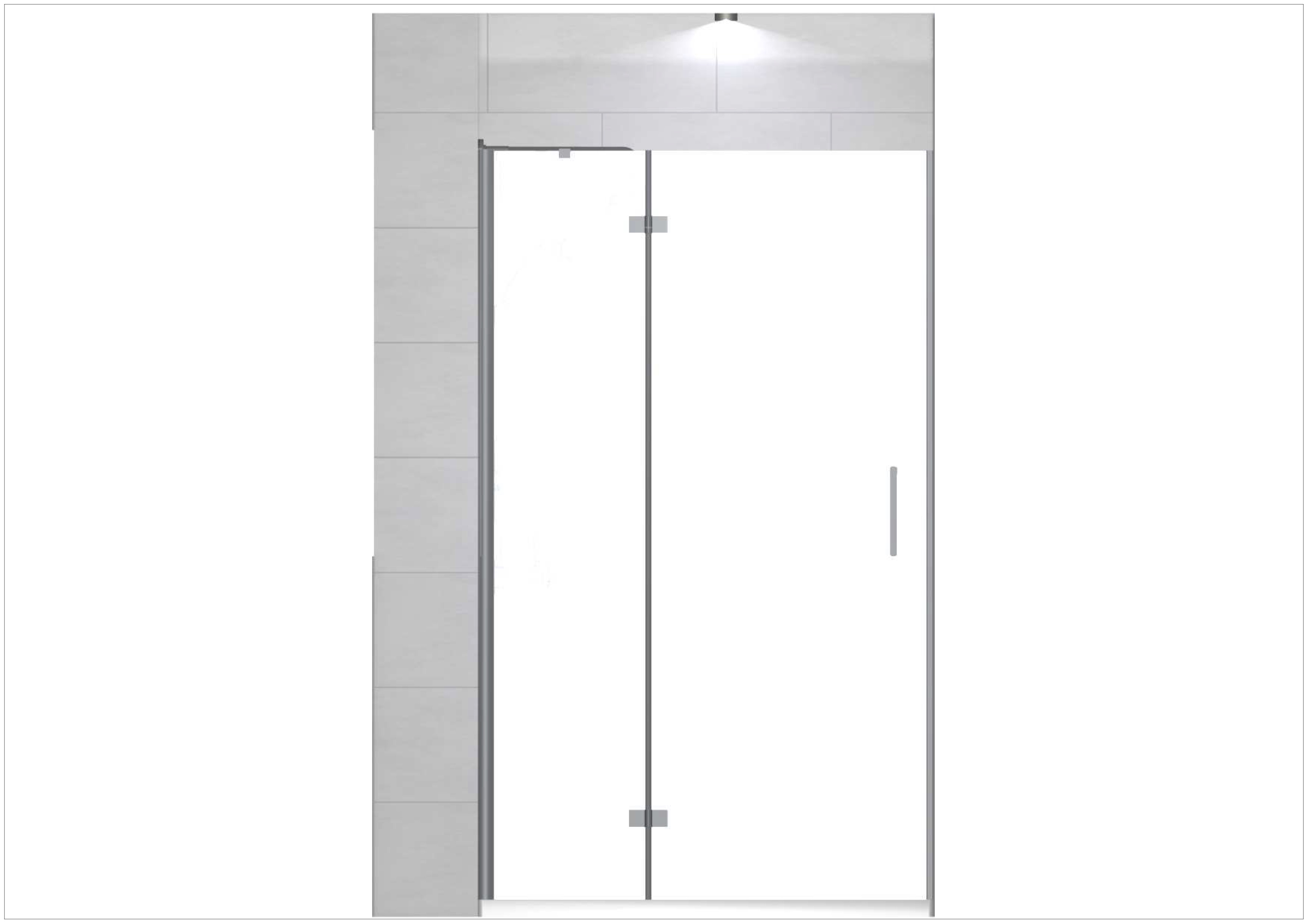
The ensuite bathroom project below was created for one of my clients who were looking to replace their kitchen, utility and 3 bathrooms that have not been refurbished for over 35 years. It is safe to say that my customers were going off their mustard bathroom furniture! The design below shows their bathroom ensuite that I created for them after conducting the home visit early this year. Please see below for the sketches created for this room.

The clients were keen to keep the bathroom fixtures traditional but have a modern appeal in other aspects. For this reason, we agreed on the Oxford basin and WC with traditional pillar taps and rainfall style shower. The units used is a part of our fitted furniture bathroom ranges available in Vienna white with a 28mm ice white laminate worktop as seen in this design. A tricky area within this design was bridging the gap between the WC unit and false wall which will house the piping and waste. To overcome this we agreed to create an open shelving unit which is wide enough for toiletries or brush holders to keep stuff off the floor. The one area within this design that doesn’t work within the space is that the customers insisted on a hinged/pivot door since the hard water in Winchester causes sliding’s doors to become seized and noisy from the limescale build up. My clients are prepared to fix a rubber stopper to the floor to prevent the door hitting the WC however, I strongly recommended sliding doors especially since they are looking to sell the property and the next owners may prefer to have a more ‘clean’ floorspace and shower enclosure. However, the customers insisted on the pivot door and the installer is happy to fix a rubber stopper to the floor. Overall, the clients were pleased with the look and feel of each room and took all the paperwork and quotes home to read over since they were unfamiliar with refurbishment projects and needed to look over all the information. After a couple weeks, we booked a final appointment and were happy to close on the deal with all 5 rooms that were designed. Since I made them aware that I study CAD at the University of Winchester, they are happy for me to disclose that the ensuite bathroom seen in the images below costs £7218.36 and the remaining rooms cost £25,030.20 totalling over £32,000 (including installation) for all the rooms designed for this client. I'm extremely pleased that the client mentioned after closing the deal that they had attained quotes from 2 other showrooms they mentioned “you were the only one who listened and designed more than what we were expecting to get out of our budget” which was extremely valuable feedback to receive. However, in future, for this scale of project, I will look at completing the kitchen at a separate time from the bathrooms as our in-store appointments lasted 4 hours and perhaps separating the kitchen from the bathrooms may help to bring this time down and will not overwhelm my clients as much with the information provided.


Home Office: Sofia White with Colmor Oak Worktop

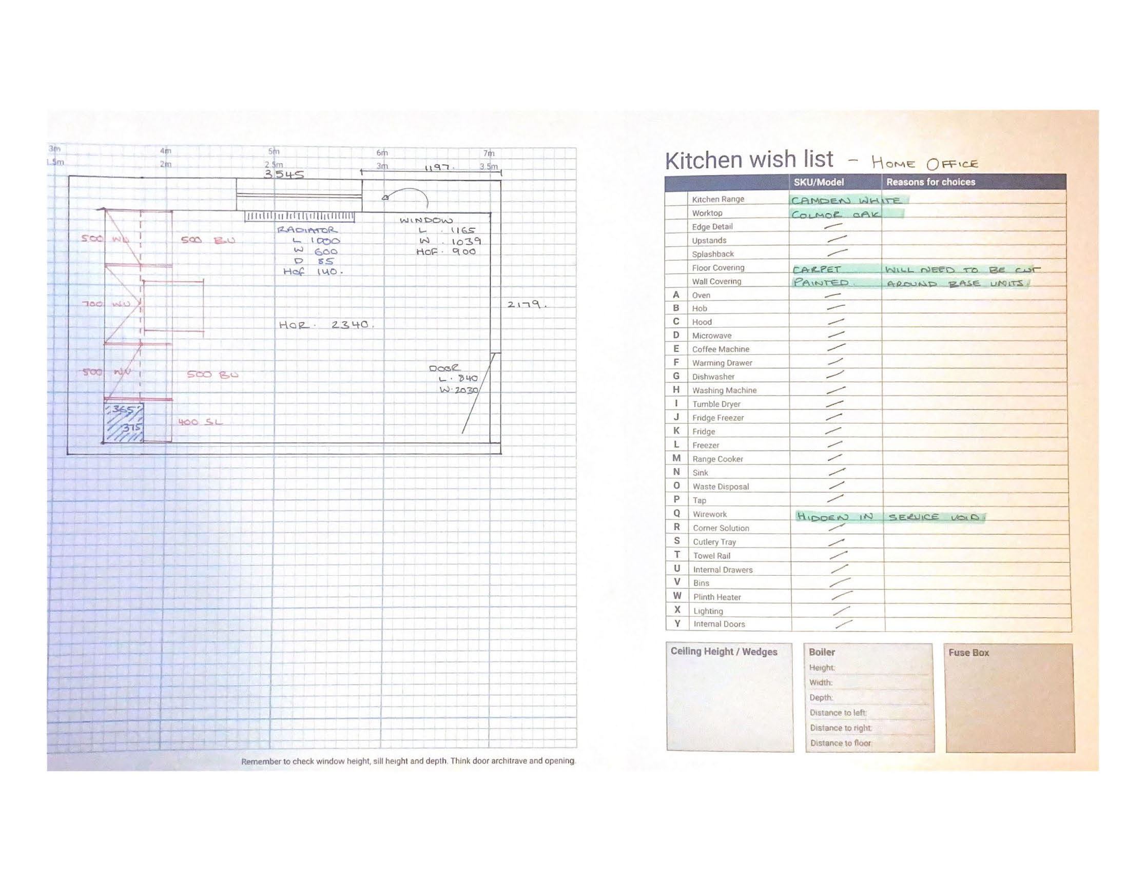
Earlier in the year, I was approached by a customer to design a home office and was not pleased with designs created by other retailers. Although this seemed daunting at first since I had not experimented with our home office catalogue much, I used this as an opportunity to push myself and learn our products and develop my home office design skills. Initially, the customer supplied measurements and we created a rough plan in-store which I then printed and handed to my client to show her husband later in the week. The following week, my client contacted me to say they are both happy with the designs which I then offered to conduct a home visit to make sure the measurements are all correct as she was unsure if the measurements, she provided was correct. Upon this home visit, numerous measurements were considerably out which would affect the design significantly. Once I collected all the measurements, I informed her that I would need to redesign the layout in one corner and raise a few queries with our supplier since she wanted to keep the floors carpeted when the office is installed. I then booked her back in for a second appointment to review the designs and potentially close the deal. Please see below for the home visit pad.

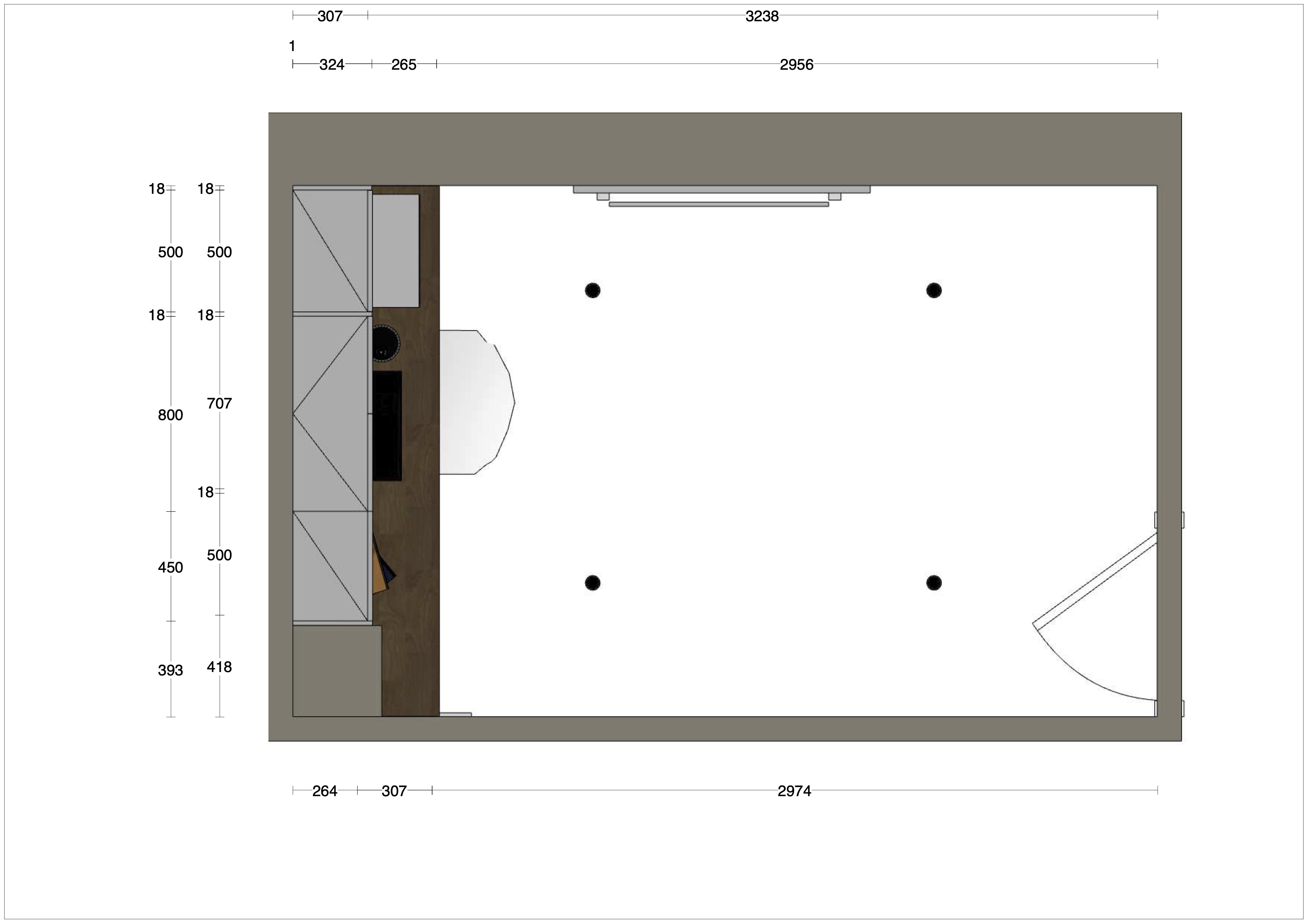
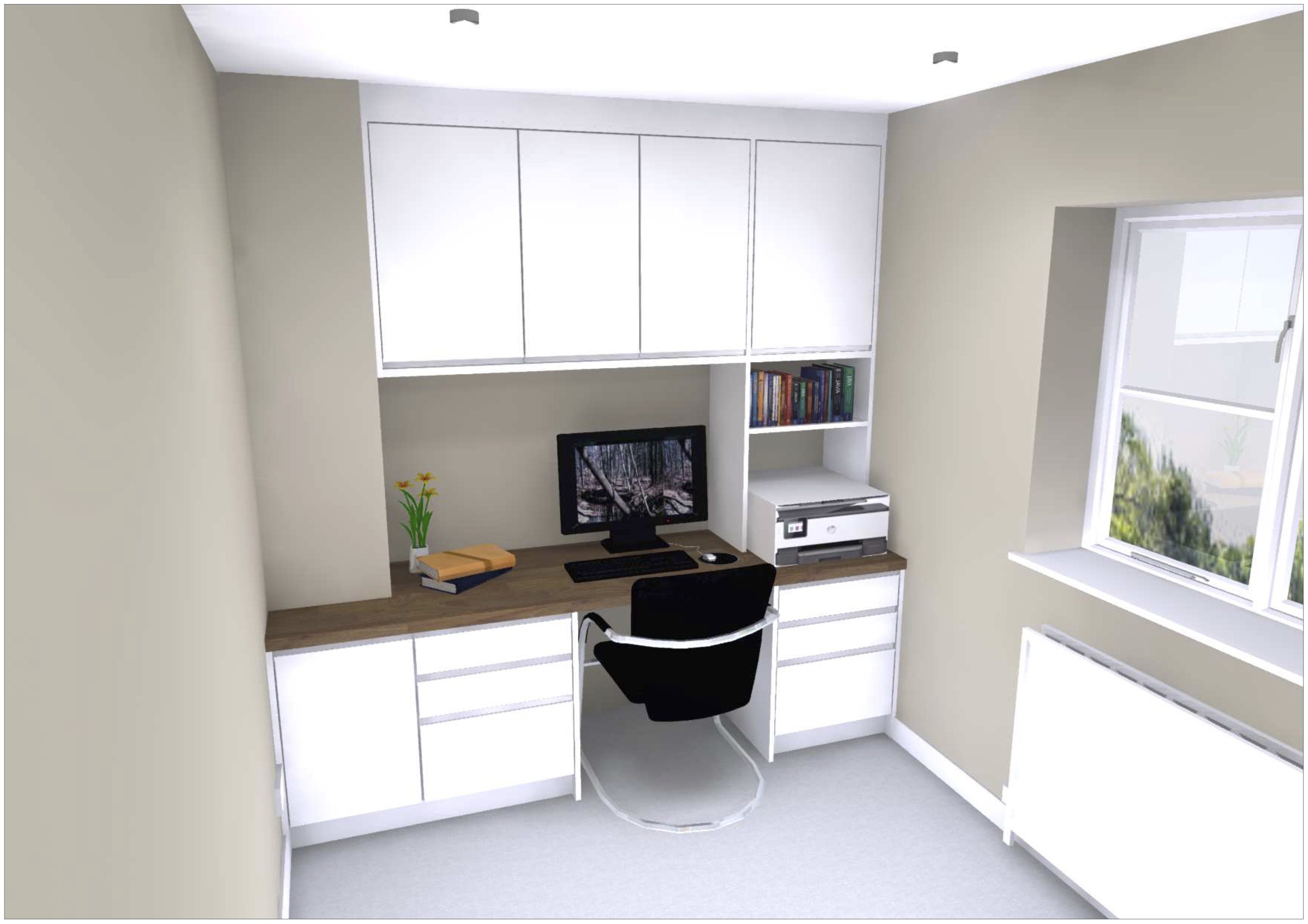
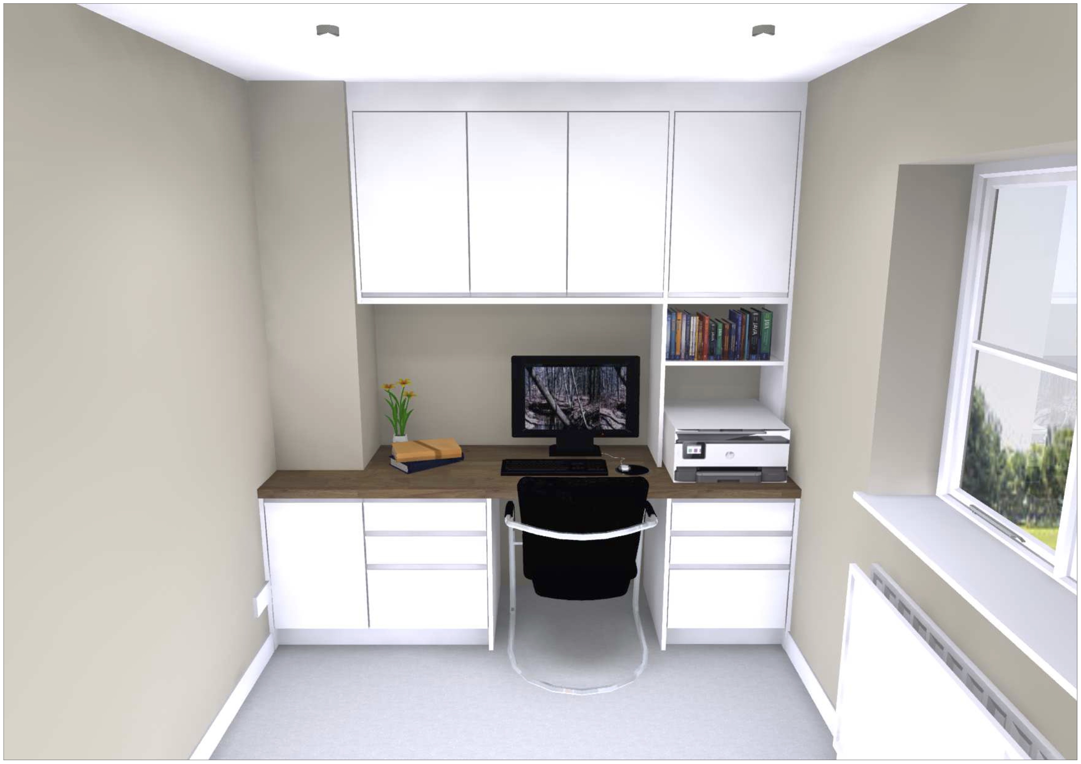
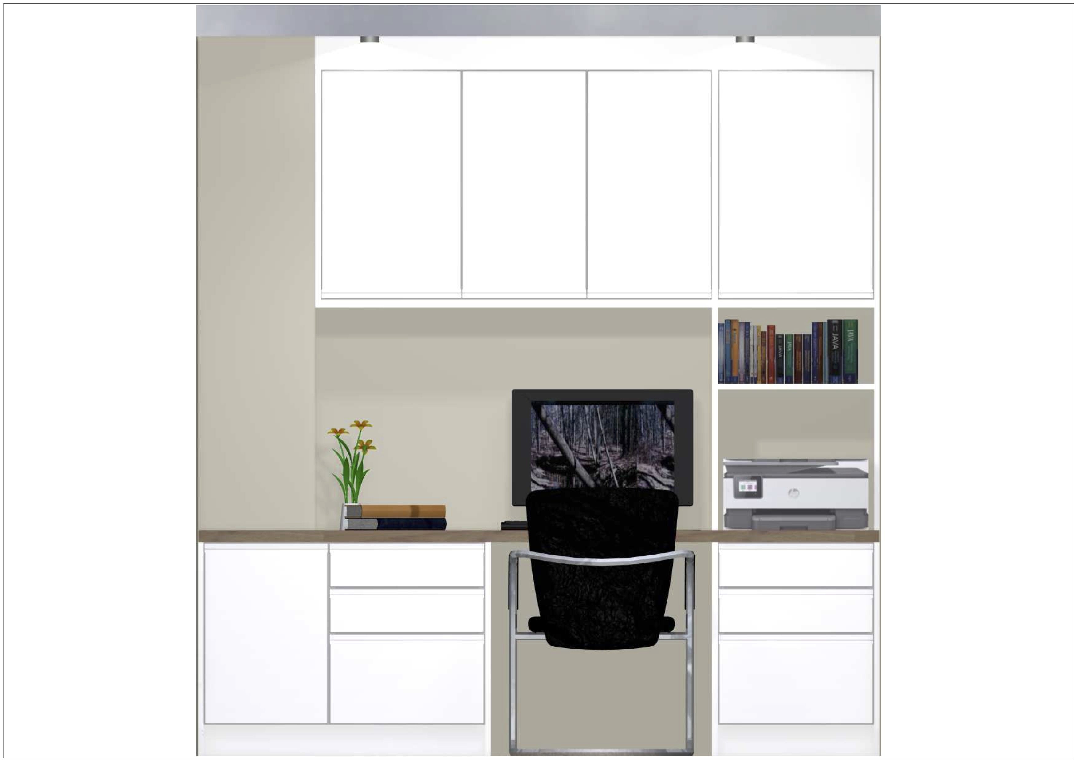
As you can see from the images below, the design is very simplistic, clean and minimalistic as the client specified, she wanted slab door fronts that are easy to wipe clean and as much closed storage as possible since noted that her husband doesn’t keep their current office space very clean. With this in mind, we agreed on the ‘Sofia White’ door fronts with a 38mm ‘Colmor Oak’ laminate. The home office range is fairly limited since it was only introduced in the middle of the pandemic and our current suppliers do not have the capacity nor the space to manufacture any more sizes or ranges. For this reason, I have managed to design most of the space to be closed with only one side of the plans to be open shelving. However, the client prefers this layout since she recently bought a printer and would like to box in the printer and have a shelf for paper or accessories to hand. After completing the design, I introduced placeholder images but unfortunately, was unable to find a printer placeholder and therefore learned a way to place a graphic on the front face of a box graphic. Since Wickes supply us with the software to design, DC’s are limited the capabilities of the package purchased by Wickes and is concerning to see that a simple printer placeholder is not available with our package. In future, I will explore tips and tricks through our forum and online videos to try and get around this issue of graphic limitations and also look to see if certain techniques may also help to create higher quality renders. Although the graphics are limited, through changing the wall colours, adding skirting, sockets and carpet textures helped to overcome this issue and bring the room together. Overall the client was pleased upon our second reveal and close appointment and is booked to purchase the designs with our installation service next week through our Barclay’s finance plans available.


Challenges:

As mentioned, the images, graphics and quality of renders is heavily limited by the package purchased by Wickes for the Fusion FX 2020 program. This semester I have focused on noting down which graphics are best to use and although some of the flooring remains blurred, I can export these images, edit within photoshop on my personal laptop and import the textures back into the program under a folder outside of the default textures provided. As you can see from the images below, this semester, the lighting has significantly improved the accuracy of the images, although, it takes slightly longer to render in-store under the new lighting settings.

Semester 1:

Semester 2:

Another particular challenge I still face today is selling or converting 4 out of 10 customers I oversee. Although this number seems relatively low, we receive a lot of people who lose interest through the journey or simply want a quote in case they would like to do a project in the future, and they often don’t come back. Also, our costs have risen since Brexit and the war between Russia and Ukraine. This is mainly because raw materials such as timber and ceramics are somtimes sourced from Ukraine and Russia have caused an increase in kitchen prices by 10% on April 12th making it harder to sell during this quarter. Since I am not coming from a selling background, I am having to learn the techniques whilst facing external factors that causes price increases and whioch results in more difficult sales when presenting and justifying the price. Fortunately, some customers are aware of the rising prices and general costs of projects but the majority of customers are surprised by project costs and therefore postpones the projects. Although I have learned to give accurate estimations at the time of the home visit, Myself and the other DC experience numerous individuals that use up our time and have unrealistic budgets for the scale of the project at hand. This results in a significant amount of wasted time which we are still looking to reduce as a team.


Time Management:

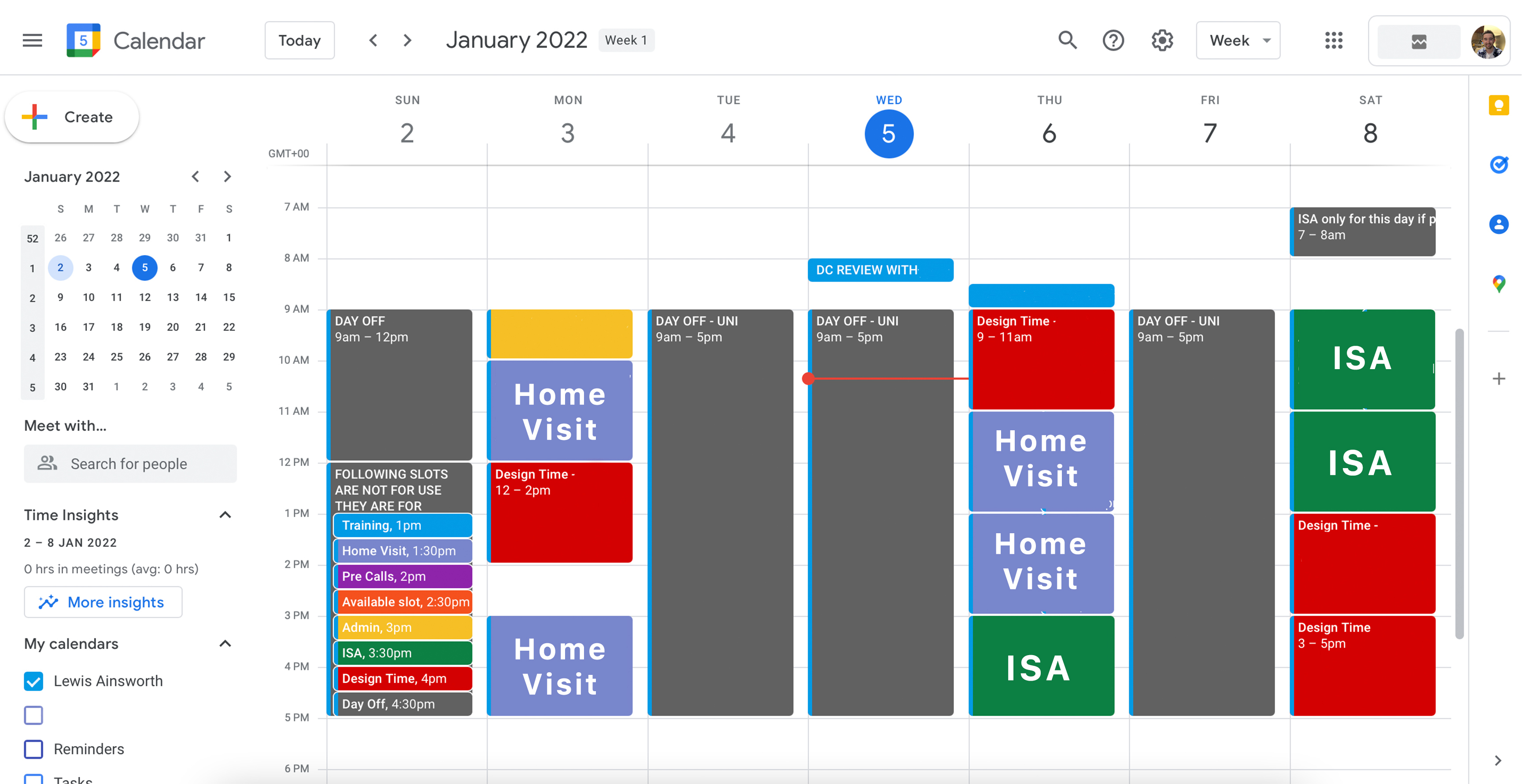
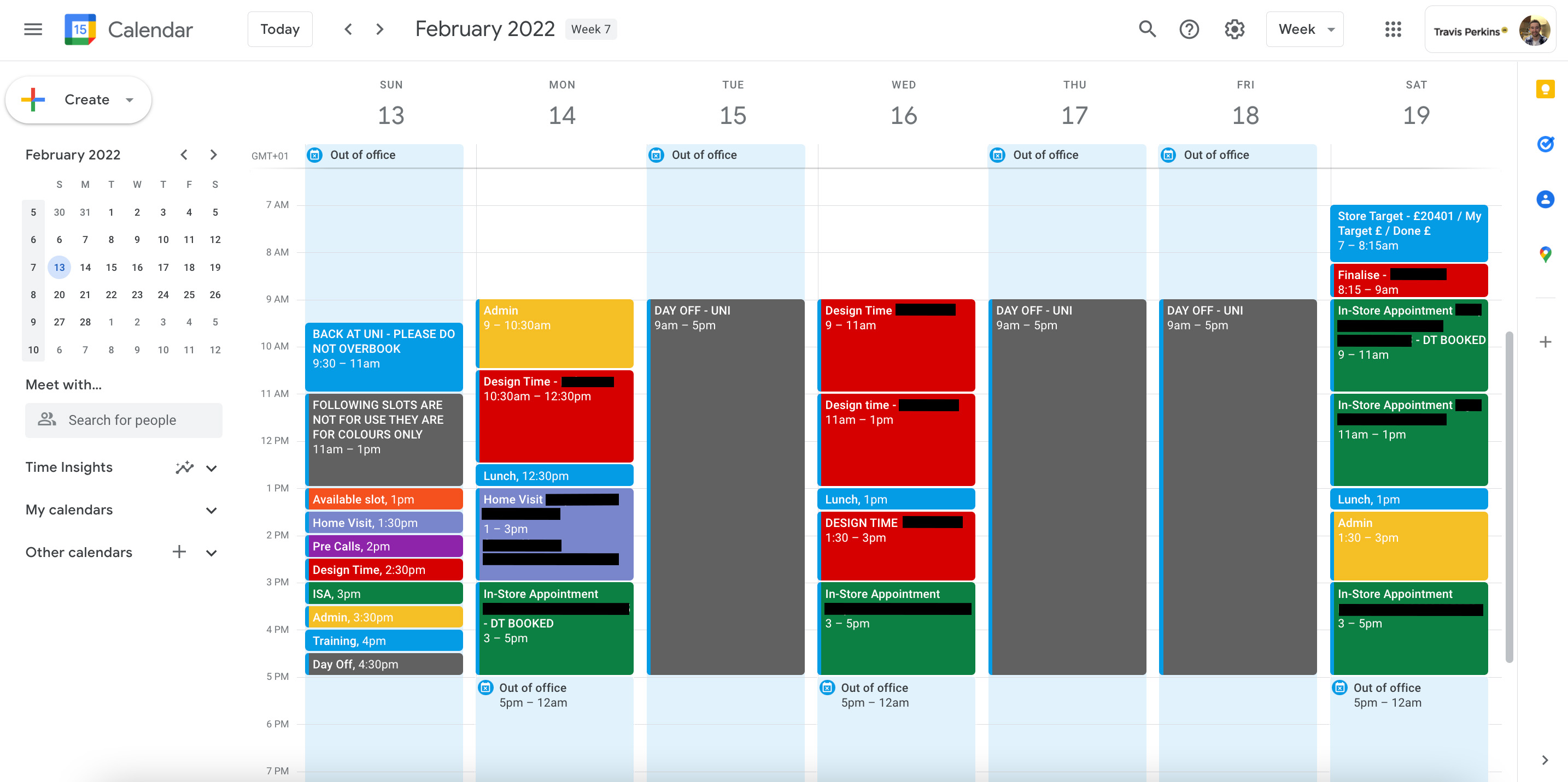
As mentioned in the introduction and challenges, I am required to sell 4 out of 10 customers, spending at least 6 hours of my time on each customer whilst only working 26 hours weeks. Therefore, time management is crucial in supporting my conversion rate and fundamentally keeping track of all my clients. For this reason, I have tweaked my calendar to manage my time better and fit in some admin time a couple times a week to catch up on emails or customer queries. Also, the team in-store are very supportive and whenever possible, book new customers in for a home visit on Monday’s, design time booked on Tuesday’s and are often back in for their reveal and close appointment on Saturday’s. This helps to predict expected sales by the end of the week and also work effectively within the hours I am contracted. Also, I set up automated email replies for when I am ‘out of office’ which lets any customers or team members know when I am next in and will respond as soon as possible. Some customers have mentioned that they appreciate this email as they are aware I am at university but were often unsure which days is best to contact the store if they need me urgently. Going forward, I am looking to go full-time after university and opening up two more days per week which will make it easier to meet to 4 out of 10 conversion rate and will allow me to be provide a more personal touch to our journey. Also, some of the designs I have sold last year are due to be fitted in the next month and the extra time will allow me to re-visit these customers and keep a strong friendship there with my client.

Semester 1:

Semester 2:


Sustainable Development Goal (SDG) 10: Reduced Inequalities

The sustainable development goals are a blueprint provided by the UN which aims towards global sustainability. SDG 10 involves reducing inequality which in this case will be to reduce inequality through designs and prototypes. The UN highlights that the GINI Index which ranges from 0 – 100 (0- income shared equally, 100- one person holds all income) has risen by 6% in emerging and developing countries due to the pandemic. It is therefore important in my role as a DC to make sure the people who have a lower income can still experience the customer journey and undergo kitchen or bathroom projects. Wickes deliver all stock to the customers who have placed an order soonest which helps to mitigate stock being prioritised or reserved for large scale projects or suites which some people cannot afford. Although there is steps that I can take to reduce financial inequality through Wickes, there is little support I can provide with regards to social inequalities. However, the understanding and development of this SDG is something that I can take forward in future practices and where possible, help to reduce social and financial inequality.


Handover Documents:

I have provided a link below to a google drive folder containing all the images below to view or download as necessary. Please feel free to click here to view the google drive folder.


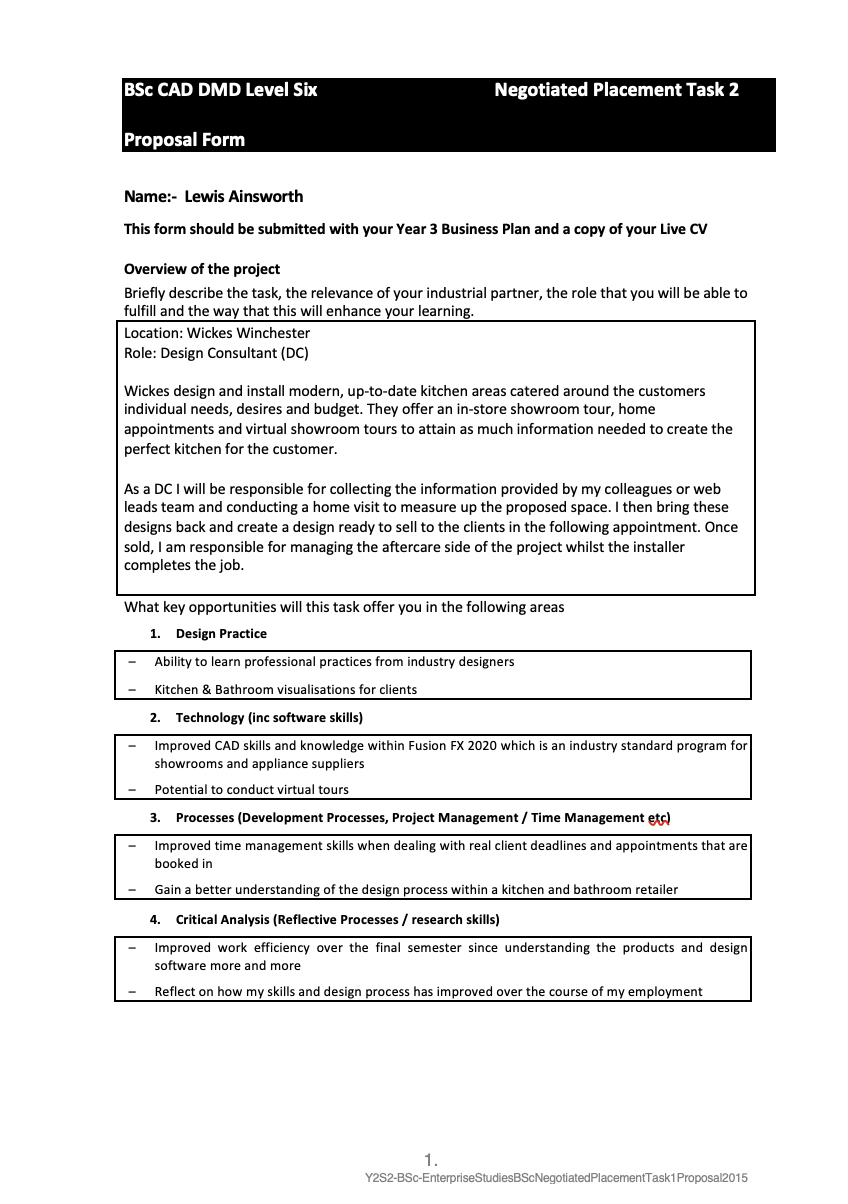
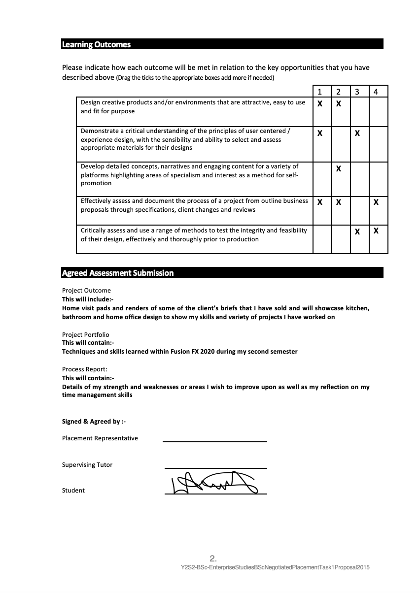
Updated Negotiated Learning Task (NLT) Form:

To download an updated PDF copy of the NLT form, please click here.

Bibliography:

Baden-Powell, C. (2005) Architect’s Pocket Book of Kitchen Design. Z-Library. Architectural Press Available at: https://b-ok.cc/book/1000132/149698.
Yazıcıoğlu, D. A. (2014) An Analytical Approach for Cabinet Door Type Selection in Kitchen Design. Save. Available at: http://www.savap.org.pk/journals/ARInt./Vol.5(4)/2014(5.4-02).pdf.
Gottlieb, R., and Couch, M. A. (1960) Using the Cross Chart in Planning Kitchen Layouts. Journal of the American Dietetic Association 36, (6) 585–592. https://doi.org/10.1016/s0002-8223(21)18237-9.
Davis, A., and Rigfisher, R. (2015) Kitchen & bath sustainable design : conservation, materials, practices. Hoboken, New Jersey: Wiley
Cheever, E. (2015) Kitchen&bath products and materials : cabinetry, equipment, surfaces. Hoboken, New Jersey: Wiley ; Hackettstown, Nj
Yasemin, A. (/2012) Ergonomic wet spaces: design factors in bathrooms designed for all. Bilkent University. Available at: http://repository.bilkent.edu.tr/handle/11693/48471.
Taylor, Z. (2020) A Study of Space Bathroom Design. Acta Astronautica 174 55–60. https://doi.org/10.1016/j.actaastro.2020.04.027.
Ainsworth, L. (n.d.) K&B on Pinterest. Pinterest. Available at: https://www.pinterest.co.uk/ladesigns_uk/kb/.